
Carousel
Kinetic Scroll family — one shared gesture core, three components on top. This page is the carousel's full reference; siblings: Overview · Scroller · List View.
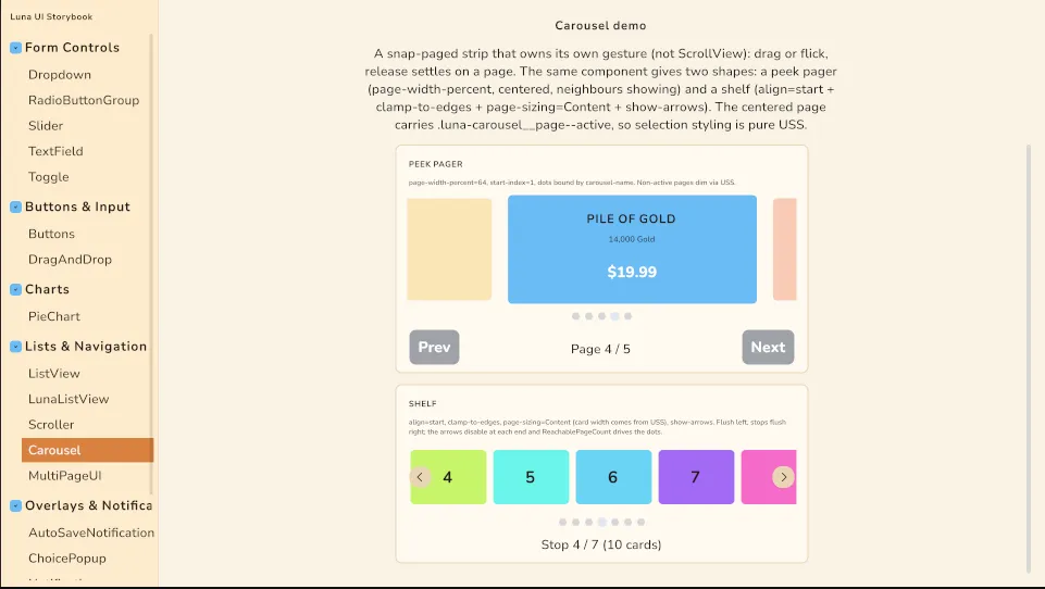
Carousel is a horizontally paged strip that snaps to the nearest page on release — the standard mobile primitive behind shop bundle strips, onboarding pagers and reward rows. Children are pages; drag or flick moves between them, release settles centered on one page with a configurable duration and easing.
It is deliberately not built on ScrollView: the component owns the whole gesture (pointer capture, velocity sampling, settle tween) on a plain container, so Unity's ScrollView elastic-offset clamp bug — the one that makes long touch lists jump near the tail — structurally cannot reach it, and the ends use a controlled rubber-band resistance instead.
Upgrading to 2.1.3? The carousel's structural styles ship in the theme's new
LibCarousel.uss(Scroller/ListView:LibScroller.uss). If your project imports the theme (directly or through the Essentials sample copy), force-reimport your theme chain once — Unity does not rebuild derived ThemeStyleSheets on its own, and without the sheet pages lose theirflex-shrink: 0and the strip collapses.
Setup
Children of the element are the pages. page-width-percent below 100 leaves the neighbouring pages peeking at the edges:
<ui:UXML xmlns:ui="UnityEngine.UIElements" xmlns:luna="CupkekGames.Luna">
    <luna:Carousel name="Offers" page-width-percent="72" settle-duration="0.28" start-index="1">
        <ui:VisualElement class="offer-card">...</ui:VisualElement>
        <ui:VisualElement class="offer-card">...</ui:VisualElement>
        <ui:VisualElement class="offer-card">...</ui:VisualElement>
    </luna:Carousel>
    <luna:CarouselDots carousel-name="Offers" />
</ui:UXML>
The carousel needs a height (USS or inline) — pages stretch to fill it. Page widths are computed by the component in pixels from the carousel's own width, so percent-width circularity never enters the layout. Give the page's content a margin if neighbouring cards should read as separate cards while peeking.
Two shapes
The same math gives both, and it is the align bias that separates them.
A peek pager is the default: a page narrower than the view, centered, neighbours showing at the edges. The gap before the first page and after the last is deliberate.
<luna:Carousel page-width-percent="72" />A shelf is a row of fixed-size cards that starts flush left and stops flush right.
<luna:Carousel align="start" clamp-to-edges="true"
               page-sizing="Content" show-arrows="true" />
page-sizing="Content" matters more than it looks. page-width-percent is a UXML
attribute, so it cannot vary per breakpoint; card widths usually do. Leave the width
to USS and the carousel measures the pitch from the laid-out pages, picking up
margins and gaps without being told about them.
clamp-to-edges also changes what "every page" means: trailing pages share the final
offset, so they are reached together. ReachablePageCount reports the honest number,
and the dots bind to it.
Attributes
| Attribute | Default | Meaning |
|---|---|---|
align | center | Where the current page sits: start, center, end, or any number 0..1 (0.35 is valid). The number is the fraction of leftover space placed before the page, so center is literally 0.5. |
clamp-to-edges | false | Stop the strip at its own edges instead of centering the end pages. Turns a pager into a shelf: no dead space before the first card or after the last. |
show-arrows | false | Build prev/next buttons over the left and right edges. They disable themselves at each end. |
page-sizing | Percent | Percent sizes pages from page-width-percent. Content leaves the authored width alone and measures the pitch instead. |
page-width-percent | 100 | Page slot width as a percent of the carousel width. Below 100, neighbours peek at the edges. Ignored when page-sizing="Content". |
settle-duration | 0.25 | Seconds for the release/SnapTo settle tween. 0 lands instantly. |
settle-easing | QuadOut | EasingType applied to the settle tween. |
flick-threshold | 600 | Release speed in px/s above which a short drag still advances one page. |
start-index | 0 | Page centered on first layout. |
API
Carousel carousel = root.Q<Carousel>("Offers");

carousel.CurrentIndex;          // settled page index
carousel.PageCount;             // live child count
carousel.ReachablePageCount;    // stops that can actually become current (see clamp-to-edges)
carousel.SnapTo(2);             // animated snap
carousel.SnapTo(0, animate: false);
carousel.IndexChanged += i => RefreshBuyButton(i);   // fires when a settle lands on a new page
carousel.PagesChanged += RebuildBadges;              // page count or size changed
A press only becomes a drag after 8px of travel, so buttons inside pages (the buy button on an IAP card) receive plain clicks; once the drag threshold is crossed, the carousel captures the pointer and the child press cancels — the standard hand-off.
Indicator dots
CarouselDots renders one dot per page, highlights the current one, and snaps on dot click. Bind by element name in UXML (carousel-name, resolved when the dots attach to the panel) or from code with dots.Bind(carousel). Place it outside the carousel element — inside it, dot presses would be interpreted as page drags.
Retheme via variables (explicit half-size radius, USS has no pill clamp):
.my-shop .luna-carousel-dot { --luna-carousel-dot: rgba(255, 255, 255, 0.3); }
.my-shop .luna-carousel-dot--active { --luna-carousel-dot-active: rgb(52, 211, 153); }
Arrows
show-arrows="true" makes the carousel build its own prev/next buttons and keep them
in step: each steps one page and disables itself at its end. They are disabled rather
than hidden, so the strip does not reflow when you reach an edge.
They are drawn in USS, not shipped as art, so a from-scratch theme gets a working chevron and any theme can replace it. Retheme with variables:
.my-shop .luna-carousel {
  --luna-carousel-arrow-size: 56px;
  --luna-carousel-arrow-inset: -28px;   /* negative puts them outside the strip */
  --luna-carousel-arrow-bg: rgb(190, 60, 70);
  --luna-carousel-arrow-bg-hover: rgb(210, 70, 80);
  --luna-carousel-arrow-color: rgb(255, 240, 230);
  --luna-carousel-arrow-radius: 8px;
  --luna-carousel-arrow-chevron-size: 14px;
  --luna-carousel-arrow-chevron-thickness: 2px;
  --luna-carousel-arrow-disabled-opacity: 0.25;
}
Variables can follow breakpoints, which is how the Showcase shop shrinks its arrows on
phones. For anything the variables do not cover, restyle .luna-carousel__arrow
directly.
A negative inset works because the root does not clip; the inner viewport does.
Classes
| Class | Element |
|---|---|
.luna-carousel | The root. Does not clip, so arrows can sit outside the strip. |
.luna-carousel__viewport | The clipping box the track moves inside. |
.luna-carousel__track | The moving strip (translate transform, component-driven). |
.luna-carousel__page | Applied to every child; carries the load-bearing flex-shrink: 0. |
.luna-carousel__page--active | Stamped on the centered page (updates on every settle and relayout). Style selection off it directly — dim siblings, gate per-page chrome — no controller code needed. |
.luna-carousel__arrow | Both arrow buttons (show-arrows). |
.luna-carousel__arrow--prev / --next | The individual arrows. |
.luna-carousel__arrow-chevron | The glyph inside each arrow, drawn from two borders. |
.luna-carousel-dots / .luna-carousel-dot / .luna-carousel-dot--active | The dots element and its children. |
"Center = selected" styling is pure USS:
.offer-strip .luna-carousel__page { opacity: 0.55; scale: 0.94; transition-property: opacity, scale; transition-duration: 0.2s, 0.2s; }
.offer-strip .luna-carousel__page--active { opacity: 1; scale: 1; }
.offer-strip .luna-carousel__page .buy-button { display: none; }
.offer-strip .luna-carousel__page--active .buy-button { display: flex; }
Showcase
The Components showcase ships CarouselShowcase.unity — an IAP-style offer strip with peeked neighbours, dots, and Prev/Next buttons wired to SnapTo. Everything visual there is stock Carousel/CarouselDots.
The Storybook (Lists & Navigation → Carousel) puts the two shapes side by side: the peek pager (dots, Prev/Next via SnapTo, IndexChanged readout, active-page styling in pure USS) above a shelf (align="start" + clamp-to-edges + page-sizing="Content" + show-arrows, with a ReachablePageCount readout).
Settings
Theme
Light
Contrast
Material
Dark
Dim
Material Dark
System
Sidebar(Light & Contrast only)
Font Family
DM Sans
Wix
Inclusive Sans
AR One Sans
Direction