Gallery
Every screen on this page comes from a demo scene that ships in the package — open it and press Play. Start with the video, then scroll the stills — each section links to the doc page that shows how it's built.
See it moving
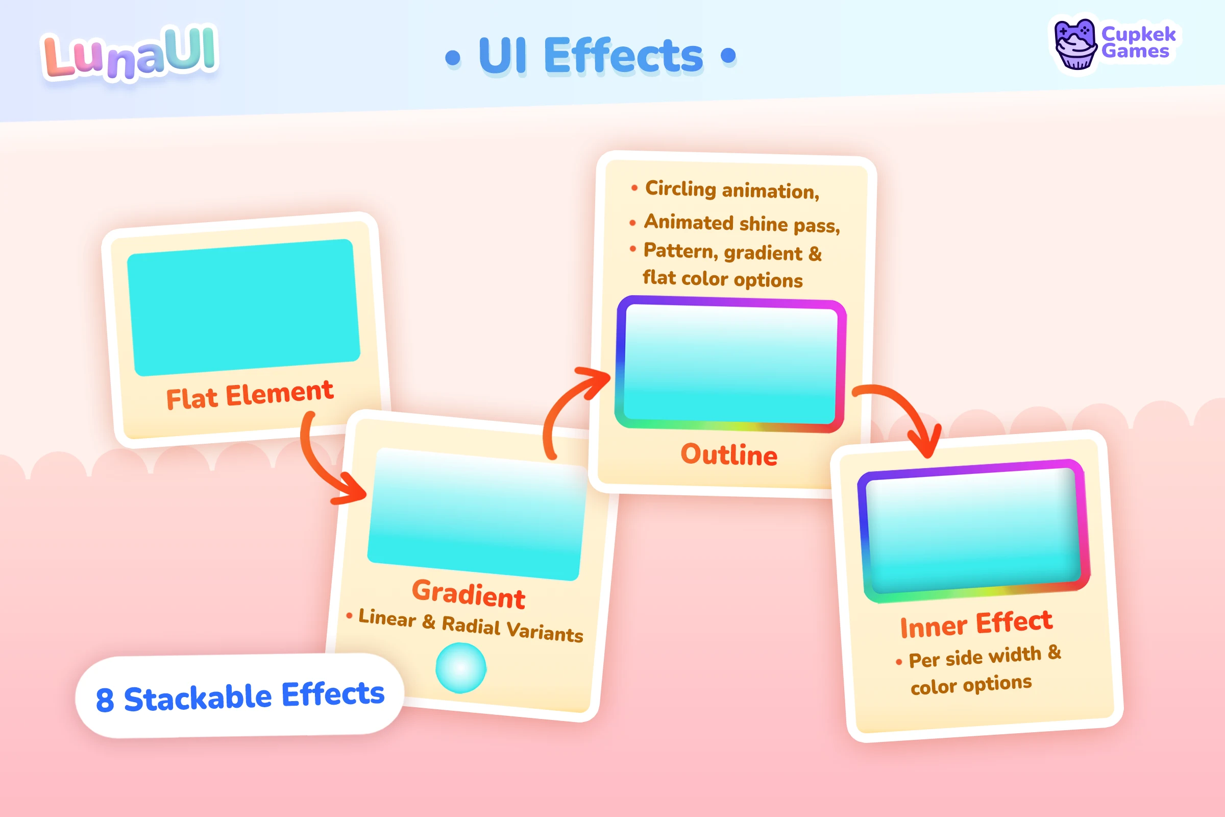
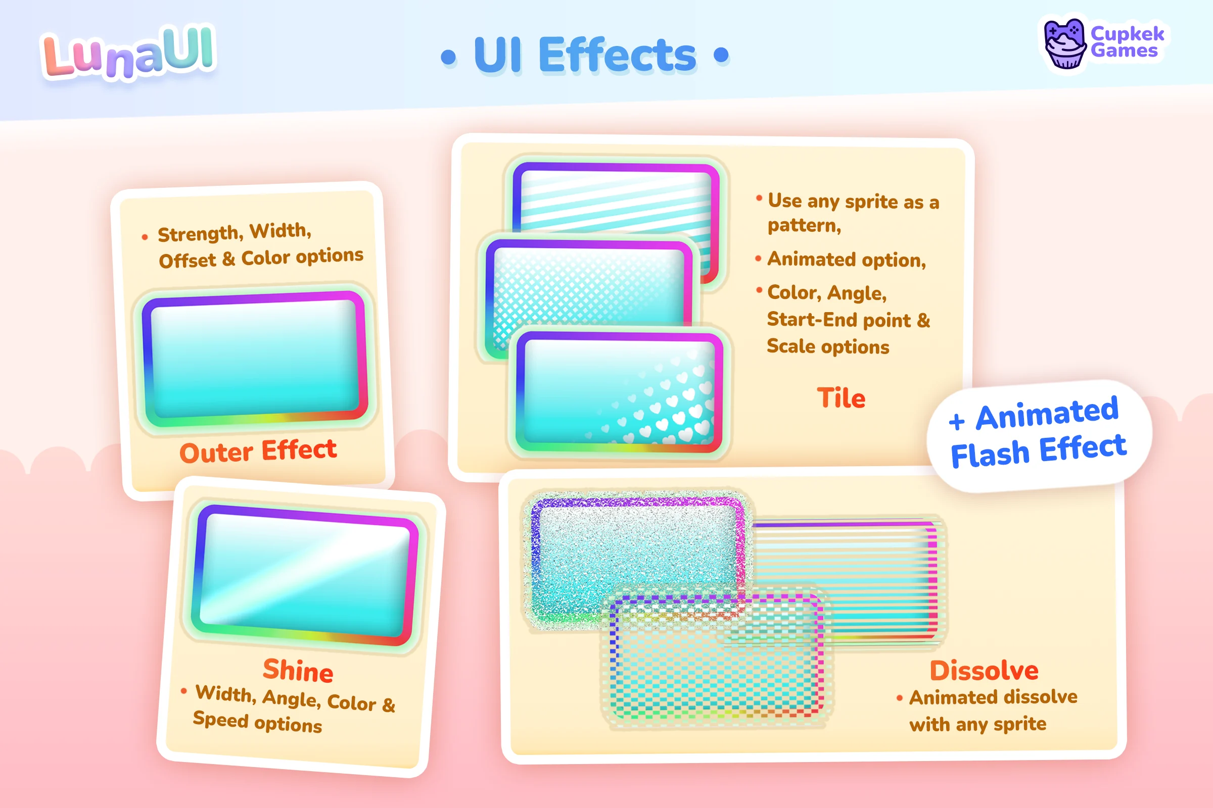
UI Effects
Shadows and glows, insets, outlines, gradients, shine sweeps, flash pulses, tiles, dissolves — eight stackable effect types, all drawn by a single SDF uber shader and layered onto any VisualElement with USS classes. No sprite sheets, no baked glow textures.
Text gets its own animated treatment — rainbow, gradient, pendulum, wave, bounce, shake and friends:
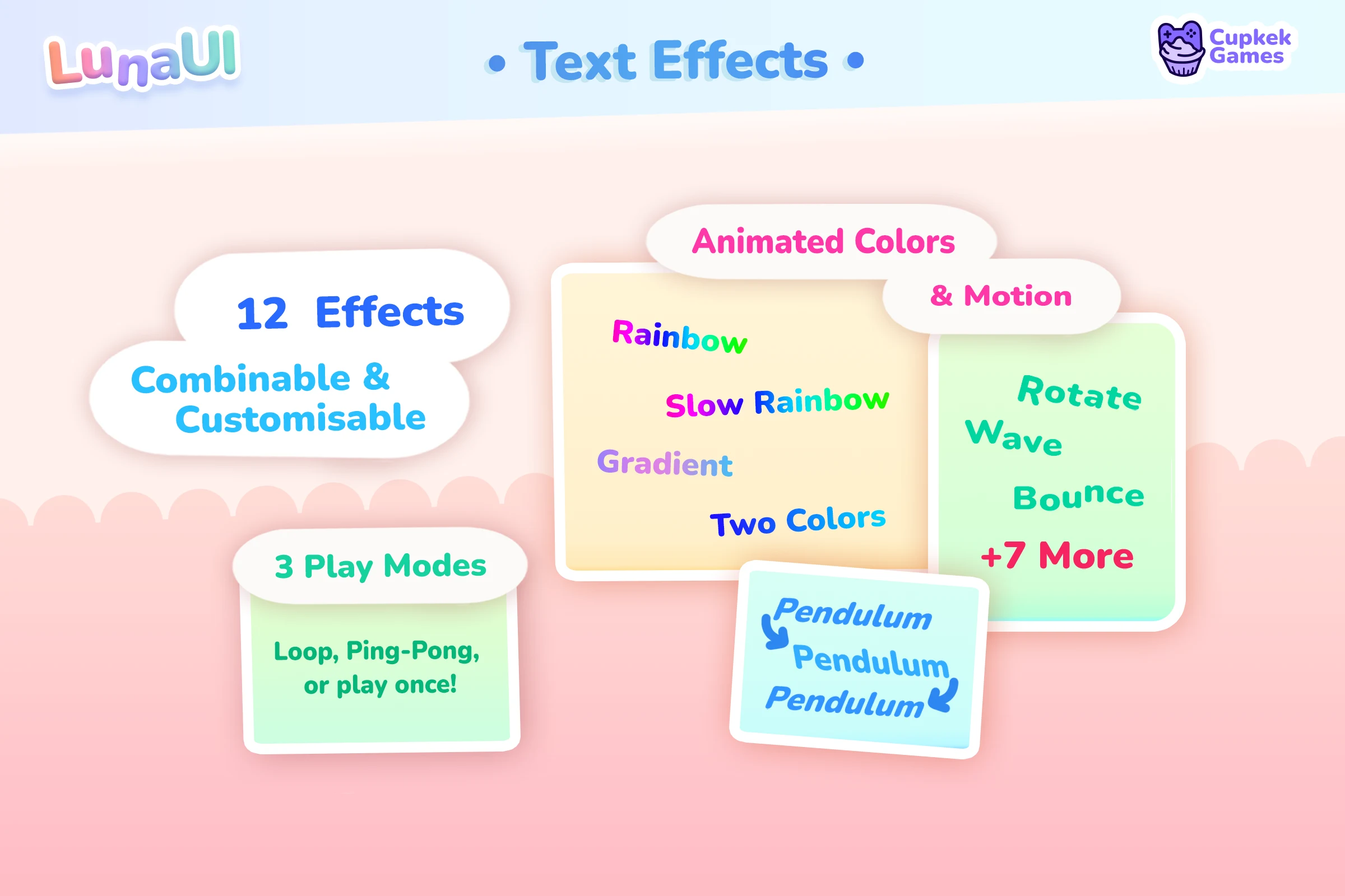
See how the effect classes stack → · Text Effects →
Transition Animations
53 ready-made presets across 7 categories — Attention, Base, Feedback, Loading, Modals, Notifications, Transitions. Play them as ScriptableObject assets from the Inspector, or build sequences in code with the fluent API.
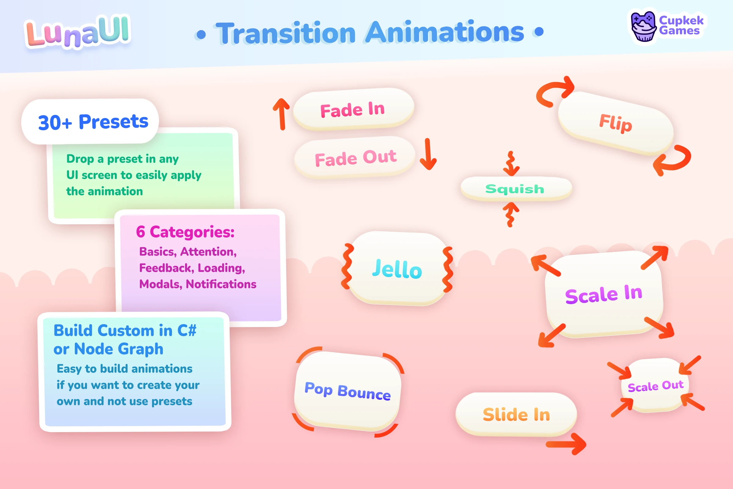
See how transition sequences work →
Navigation Graph
Your screens become nodes in a NavGraphSO asset — modals, tabs, drill-downs, full-screen takeovers — and at runtime you push and pop them by string id with back-button semantics handled for you.
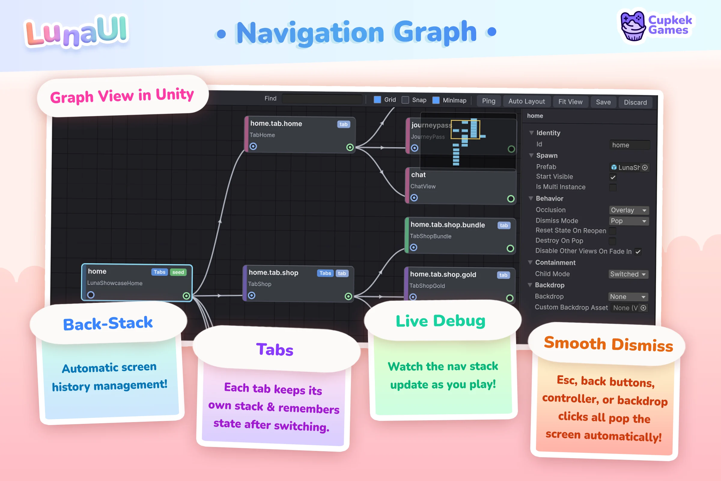
See how the navigation stack works →
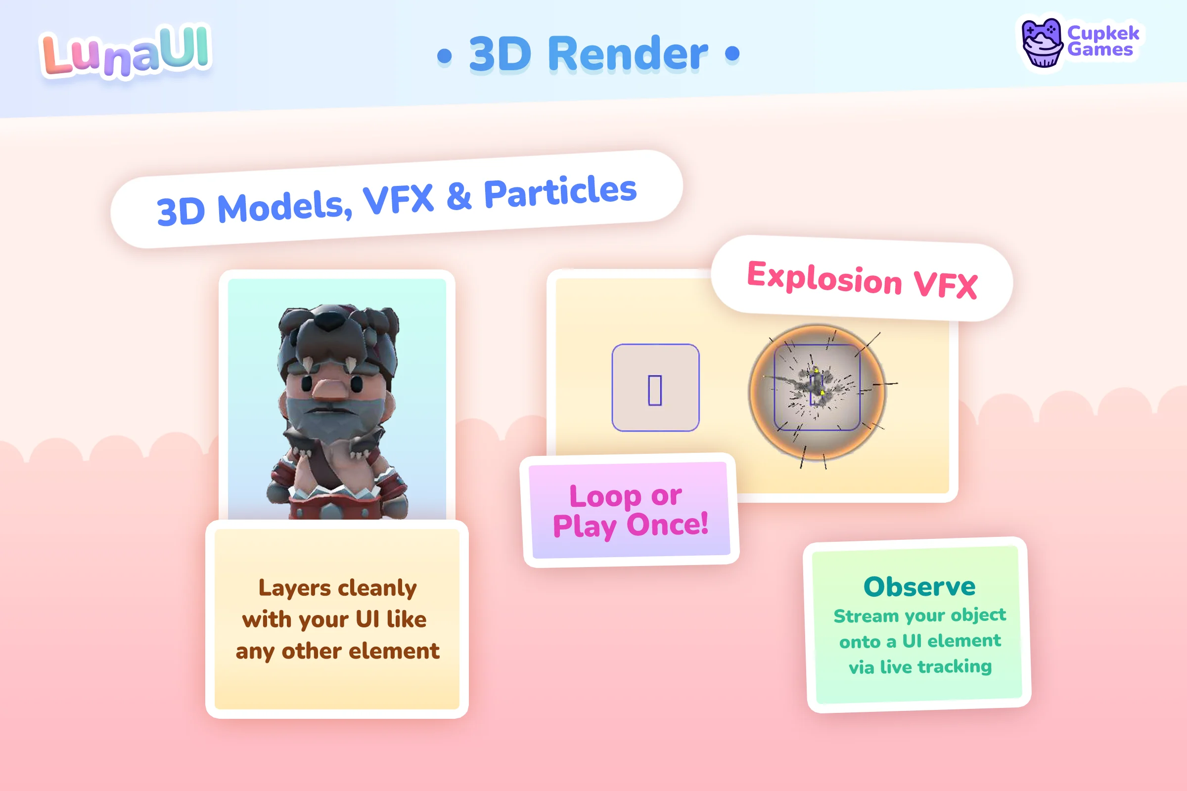
3D in your UI
A pooled Camera → RenderTexture → UI Toolkit pipeline puts live 3D — characters, particle systems, VFX Graph effects — onto any element. The demo below shows the four ways to feed it: prefab copies, borrowed scene instances, raw RenderTextures on a plain VisualElement, and no-touch observation.
UI Attractor
The classic fly-to-HUD reward: a burst of pooled VisualElement particles scatters out from the source, then homes into the target element. Pure UI Toolkit — no cameras, no RenderTextures, no ParticleSystem — so it scales to hundreds of coins, gems, or XP orbs.
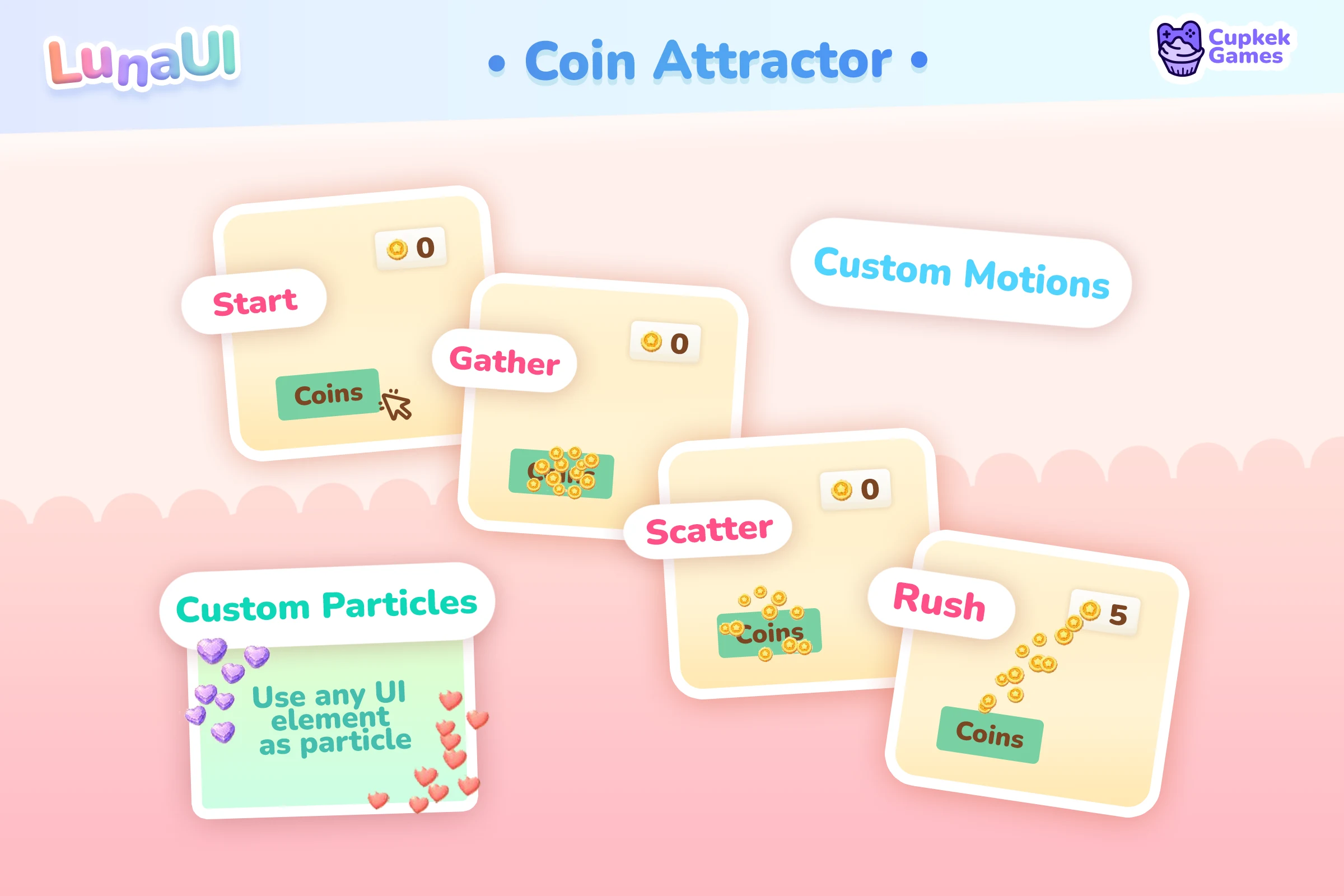
See how bursts are configured →
Responsive Scaling
One UI that fits phones and desktops — density-aware breakpoints for layout, automatic per-device scaling, and a player UI-Scale slider. No separate mobile and desktop builds.
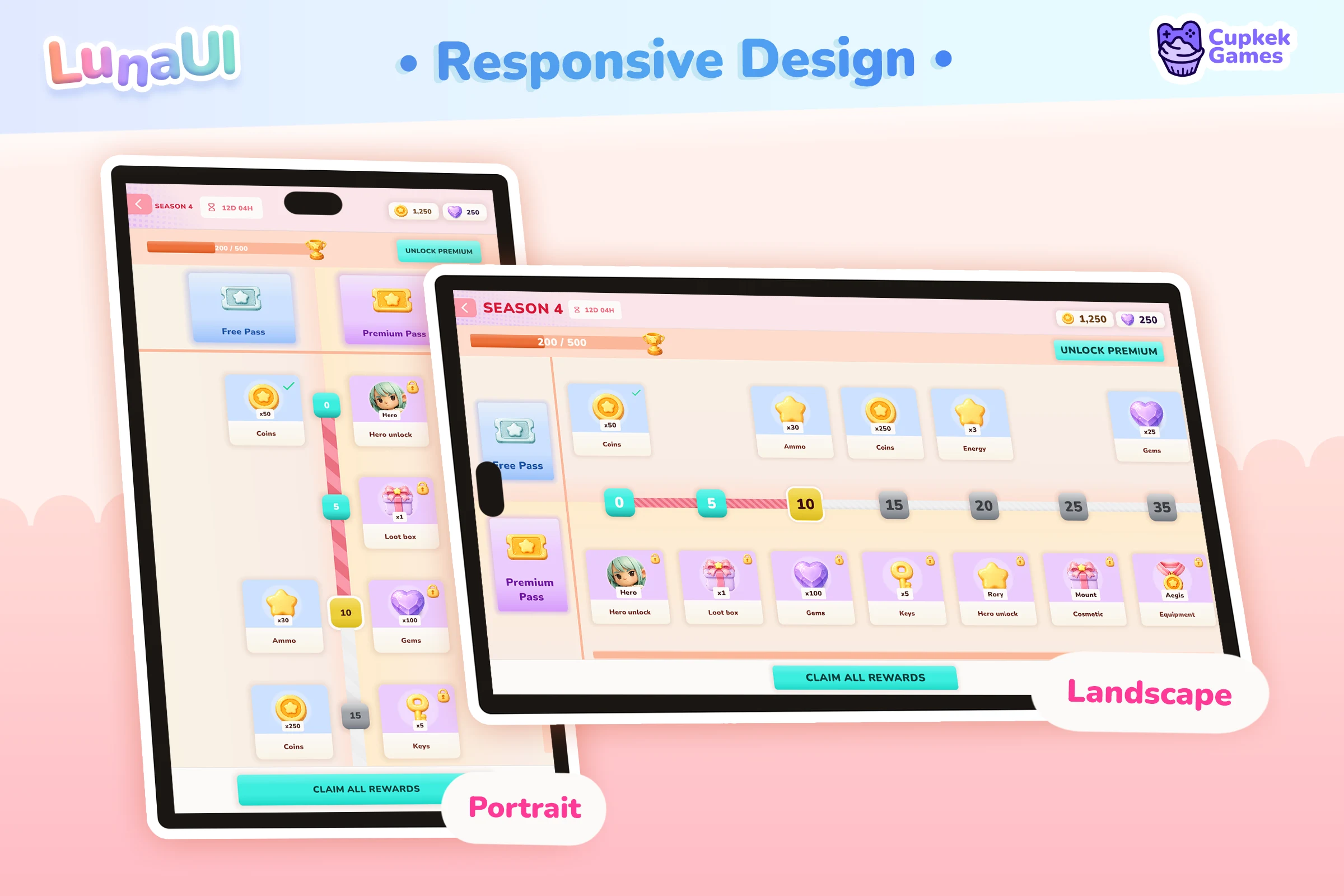
See how responsive scaling works →
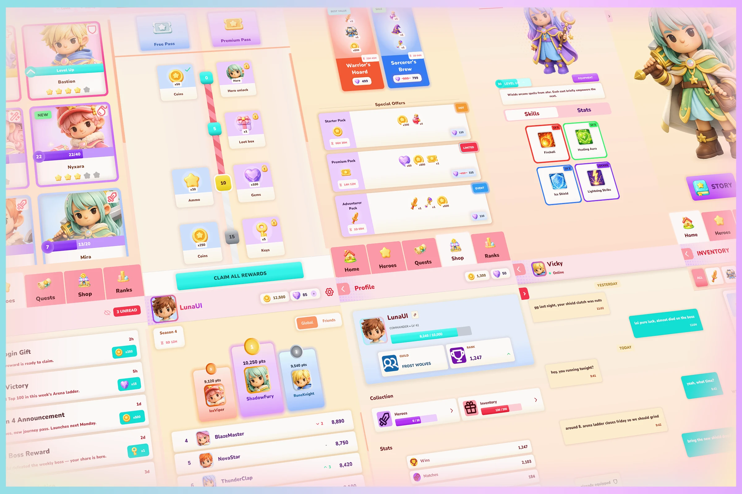
Components & full game shells
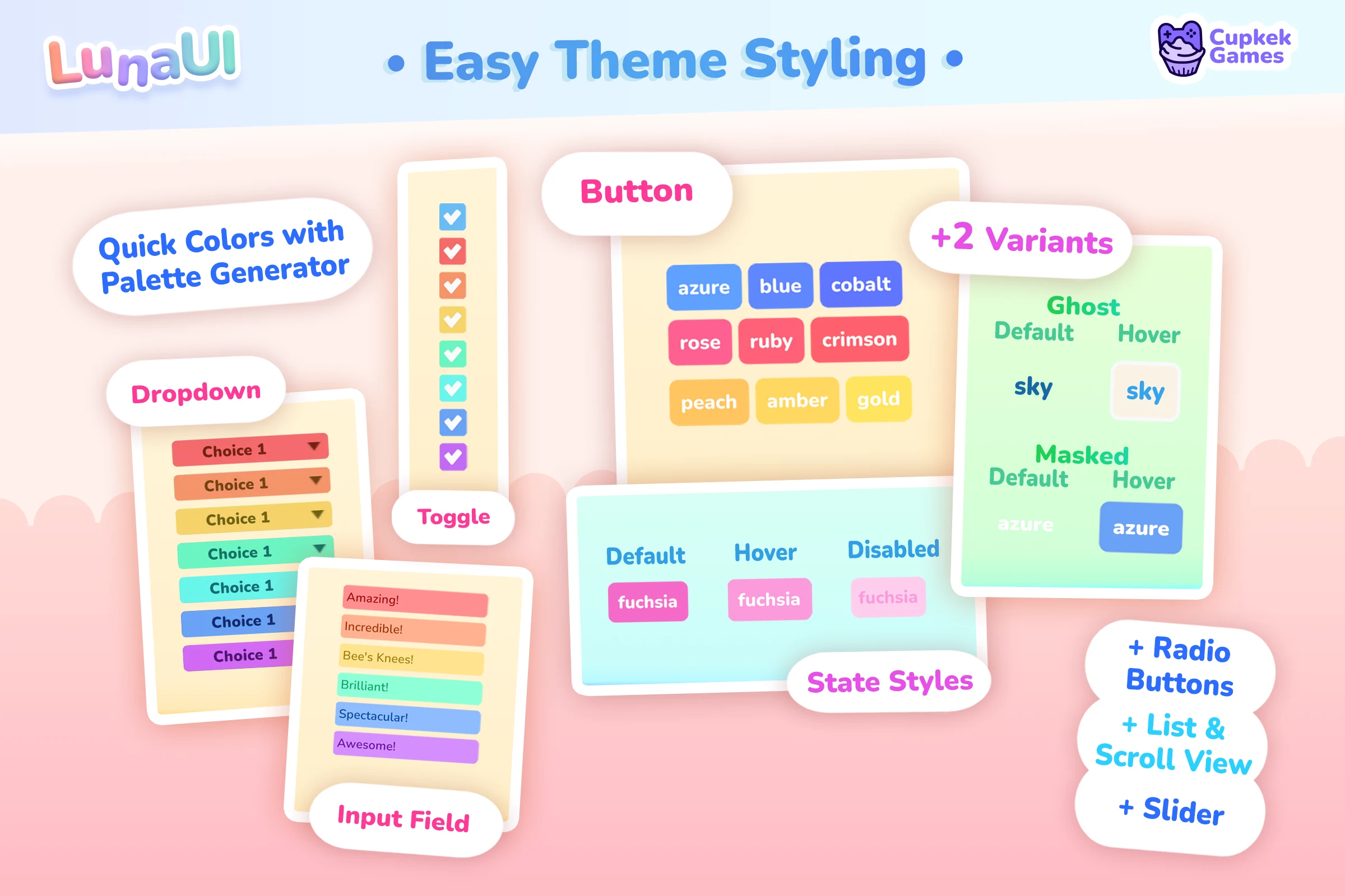
The component set is themed, focus-navigable, and controller-ready out of the box. Buttons, dropdowns, toggles, text fields, sliders and more all pick up the look from a single stylesheet:
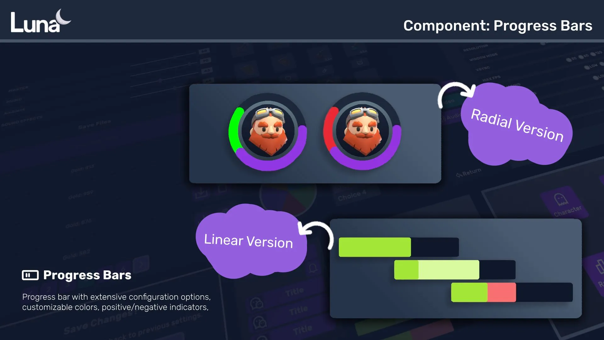
Progress bars — radial and linear versions with configurable colors and positive/negative indicators:
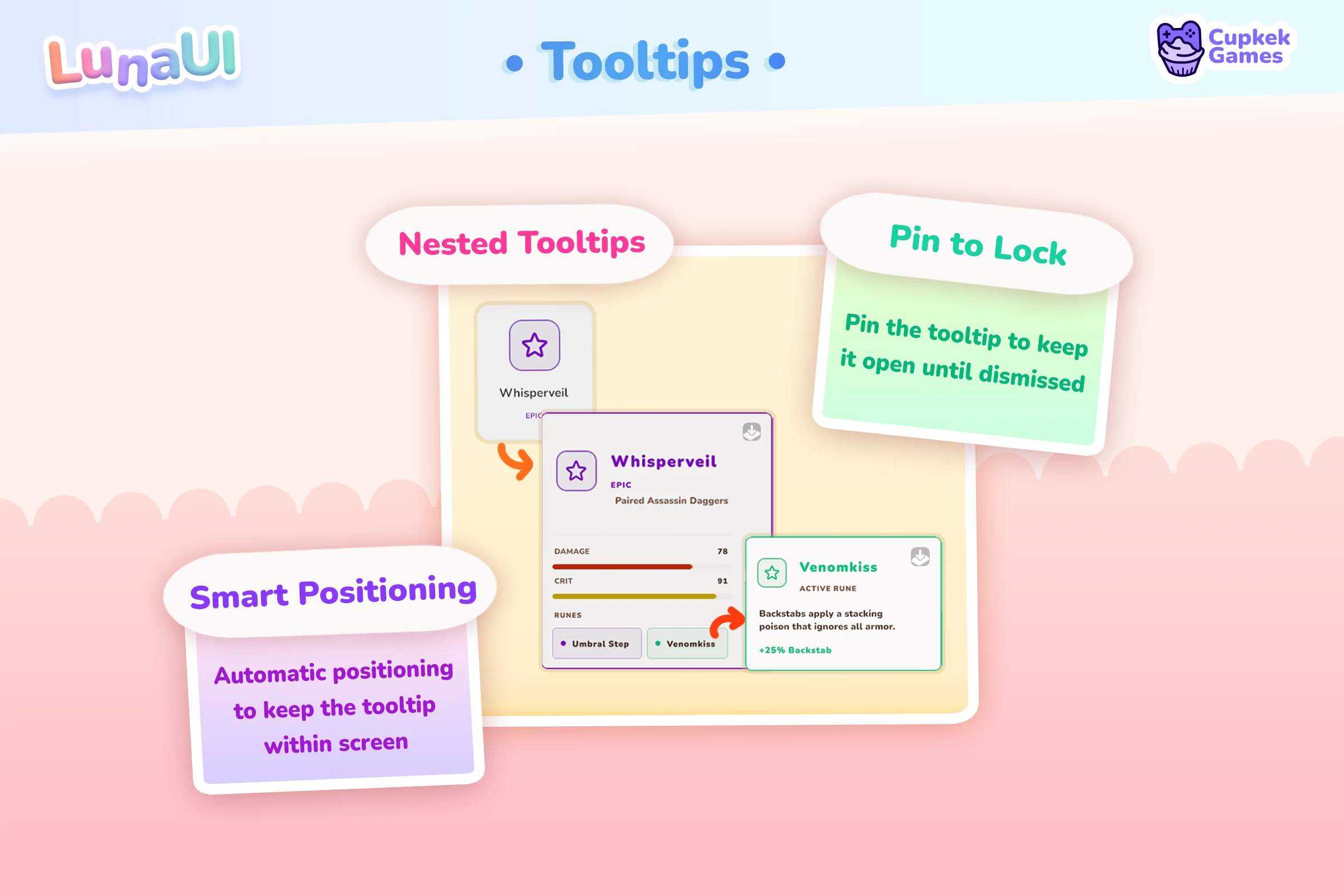
Tooltip — attach to any visual element; here on a skill grid:
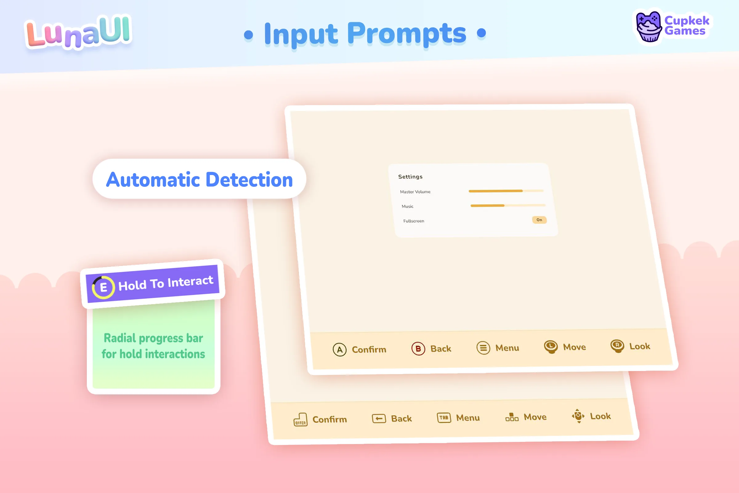
Input prompts — keyboard and controller icons that swap automatically on control-scheme change, with rebinding support:
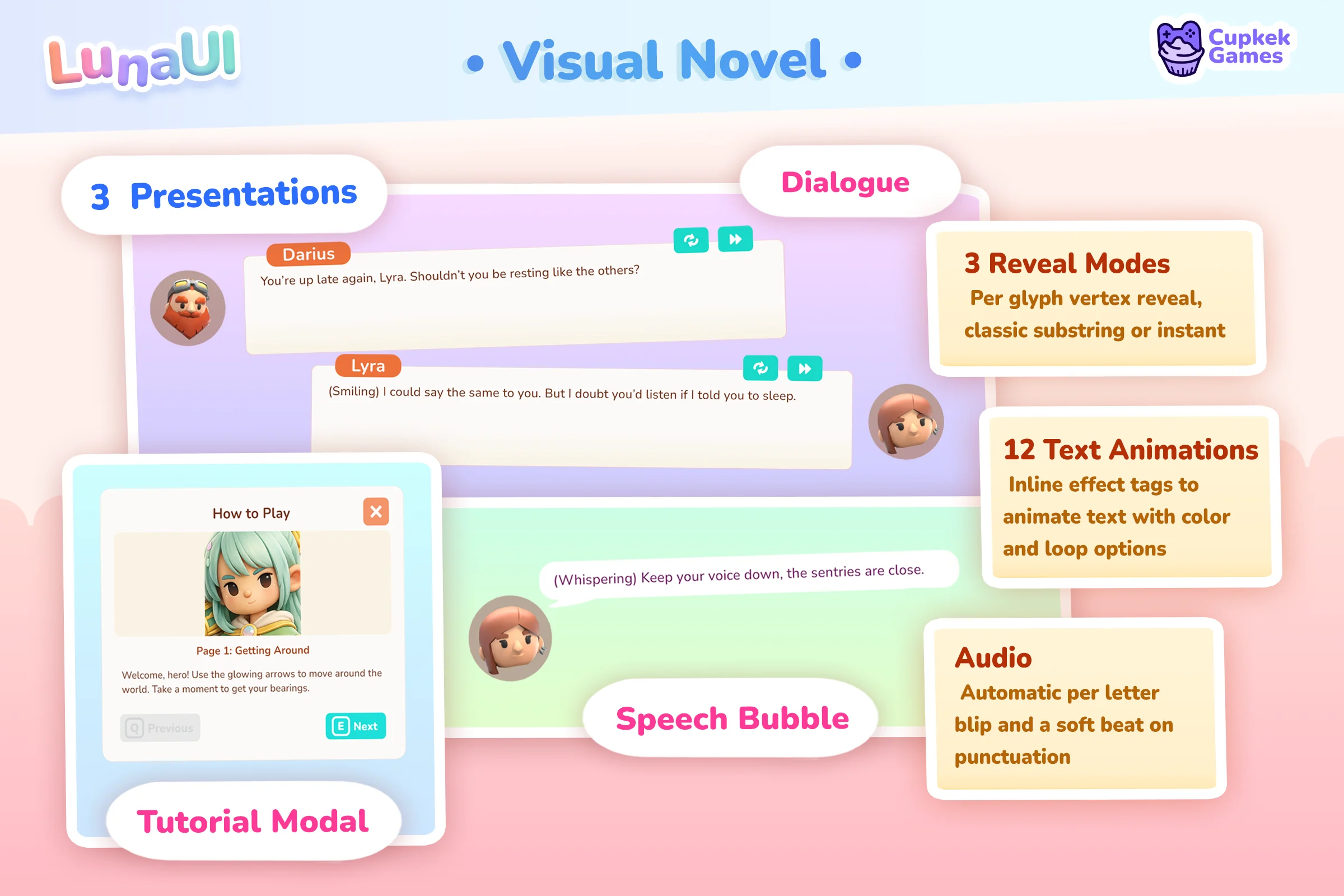
Dialogue — Speech Bubble, Visual Novel, and Tutorial Modal views:
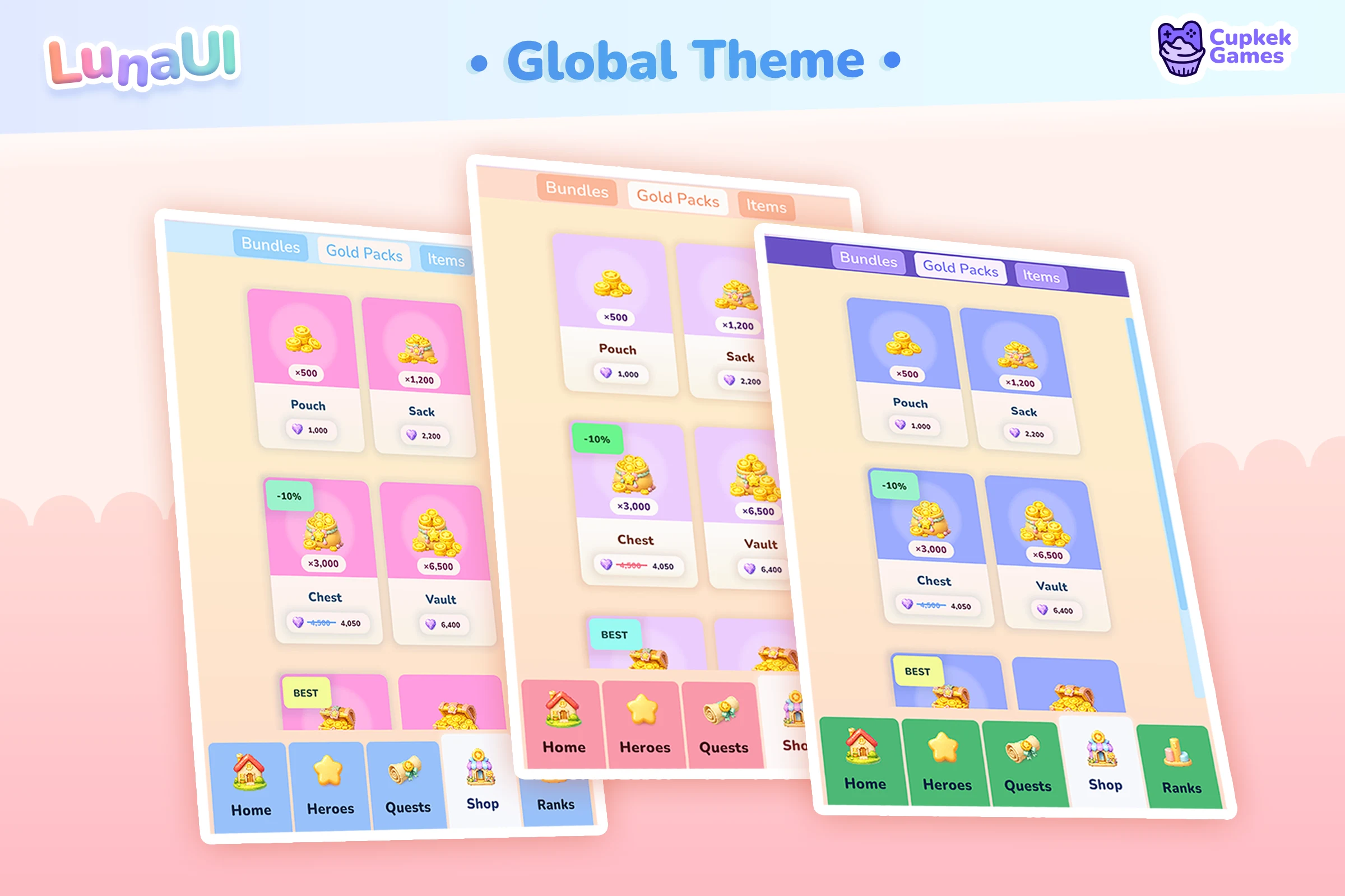
Styling is utility-class driven — compose looks straight in UXML, or change one global color and watch the whole project follow:
And it all assembles into full game shells — main menu, settings, inventory, pause, credits, scene transitions with loading screens:
Browse all components → · Browse the views → · The GameFull scaffold →
Try it yourself
Settings
Theme
Light
Contrast
Material
Dark
Dim
Material Dark
System
Sidebar(Light & Contrast only)
Font Family
DM Sans
Wix
Inclusive Sans
AR One Sans
Direction