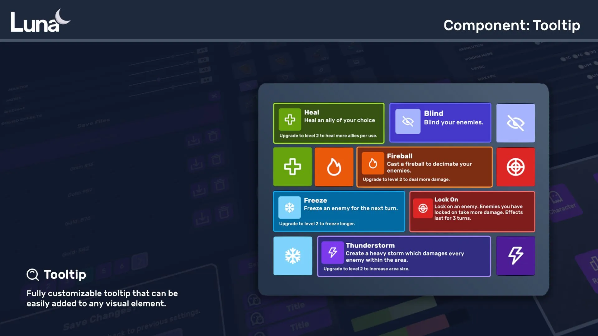
Tooltip
Tooltip + TooltipController + TooltipManipulator together drive a smart hover/focus tooltip system: smooth size/position tweens, off-screen prevention, multi-column comparisons, nested tooltips, and pooling.
Features
- Smooth size/position updates with configurable fade settings
- Auto-positioning that prevents tooltips from going off-screen
- Multi-column layouts — perfect for inventory-vs-equipped comparisons
- Nested tooltips with customizable locking behavior
- Object pooling for performance with many tooltips
- Disabled state to programmatically gate tooltip opening
Setup
- Place a single
TooltipControllerMonoBehaviour in the scene; it owns the on-screenTooltipelement. - For each element that should show a tooltip, add a
TooltipManipulatorwith one or moreTooltipContainerSetups.
[SerializeField] private TooltipController _tooltipController;

// `root` is the visual tree delivered by your PanelRenderer's reload
// callback — see the Example below.
VisualElement target = root.Q<VisualElement>("TooltipOnHover");

// The tooltip's content slots are plain VisualElements you create:
VisualElement image = null;                       // optional icon slot
Label title = new Label("My Tooltip Title");
Label body  = new Label("My Tooltip Description");

var setup = new TooltipContainerSetup(
    image, title, body, bottom: null,
    colorBackground: new UIColor("slate", UIColorValue.V_800),
    colorBorder: new UIColor("slate", UIColorValue.V_200)
);

var manipulator = new TooltipManipulator(gameObject, _tooltipController);
manipulator.SetSetup(setup);
target.AddManipulator(manipulator);
⚠️ One
TooltipManipulatorinstance per target element. AManipulatorattaches to one element at a time, so adding the same instance to a second element silently detaches it from the first. (TheTooltipContainerSetupcan be shared across manipulators.)
Inspector (UxmlAttributes)
The Tooltip element exposes fade settings:
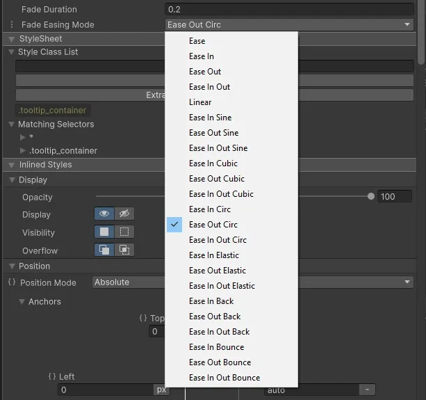
| Attribute | Description |
|---|---|
FadeDuration | Duration of the fade-in/out animation. |
FadeEasingMode | Easing curve for the fade. |
CSS classes
Add these to the target element (the one that should display a tooltip), not to the tooltip itself.
Position
Default position is top.
| Class | Effect |
|---|---|
tooltip-left | Position the tooltip to the left of the target. |
tooltip-right | Position the tooltip to the right of the target. |
tooltip-bottom | Position the tooltip below the target. |
Follow mouse
| Class | Effect |
|---|---|
tooltip-follow | Position the tooltip relative to the cursor and follow it. Position classes still apply. |
API
TooltipController
A MonoBehaviour that owns the Tooltip element.
TooltipController.Tooltip.SetTooltipEnabled(false);   // mute all tooltips
TooltipController.Tooltip.SetTooltipEnabled(true);    // resume
Useful during drag operations, cutscenes, or when another UI element should have focus.
TooltipManipulator
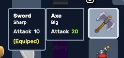
// Multi-column variant (item-vs-equipped comparison)
public TooltipManipulator(GameObject parent, TooltipController tooltipController, List<TooltipContainerSetup> setups);

// Single-column variant
public TooltipManipulator(GameObject parent, TooltipController tooltipController);
manipulator.SetSetup(setup);| Parameter | Type | Description |
|---|---|---|
parent | GameObject | Tooltip auto-closes when this object is disabled. |
tooltipController | TooltipController | Reference to the scene's controller. |
setup(s) | TooltipContainerSetup | Per-column container setup. |
TooltipContainerSetup
public TooltipContainerSetup(
    VisualElement image,
    VisualElement title,
    VisualElement body,
    VisualElement bottom,
    UIColor colorBackground = null,
    UIColor colorBorder = null,
    int maxWidth = 512,
    VisualElement absoluteBackground = null
)| Parameter | Type | Description |
|---|---|---|
image | VisualElement | Image slot (e.g. item icon). |
title | VisualElement | Title slot. |
body | VisualElement | Body slot. |
bottom | VisualElement | Free-form bottom slot — use this when you don't want the prior row layout. |
colorBackground | UIColor | Container background tint. |
colorBorder | UIColor | Container border tint. |
maxWidth | int | Max container width in pixels (default 512). |
absoluteBackground | VisualElement | Optional element rendered as an absolute background behind the container. |
Example
PanelRenderer delivers its visual tree asynchronously — query the target element in the reload callback, not in Awake/Start:
using UnityEngine;
using UnityEngine.UIElements;
using CupkekGames.Luna;

public class MyTooltipSetup : MonoBehaviour
{
    [SerializeField] private TooltipController _tooltipController;
    [SerializeField] private Sprite _mySprite;

    private PanelRenderer _panelRenderer;

    private void Awake()
    {
        _panelRenderer = GetComponent<PanelRenderer>();
        _panelRenderer.RegisterUIReloadCallback(OnUIReload);
    }

    private void OnDestroy()
    {
        _panelRenderer.UnregisterUIReloadCallback(OnUIReload);
    }

    private void OnUIReload(PanelRenderer renderer, VisualElement root, int version)
    {
        VisualElement tooltipOnHover = root.Q<VisualElement>("TooltipOnHover");

        VisualElement image = new VisualElement();
        image.AddToClassList("size-40");
        image.style.backgroundImage = new StyleBackground(_mySprite);
        Label title = new Label("My Tooltip Title");
        Label body = new Label("My Tooltip Description");
        VisualElement bottom = null;

        UIColor bgColor = new UIColor("slate", UIColorValue.V_800);
        UIColor borderColor = new UIColor("slate", UIColorValue.V_200);

        var containerSetup = new TooltipContainerSetup(image, title, body, bottom, bgColor, borderColor);

        TooltipManipulator manipulator = new TooltipManipulator(gameObject, _tooltipController);
        manipulator.SetSetup(containerSetup);

        tooltipOnHover.AddManipulator(manipulator);
    }
}
See also
- Notifications — non-hover-driven popups
- InputPrompt — gamepad-friendly icons that pair well with tooltips
Settings
Theme
Light
Contrast
Material
Dark
Dim
Material Dark
System
Sidebar(Light & Contrast only)
Font Family
DM Sans
Wix
Inclusive Sans
AR One Sans
Direction