Progress Bar
Progress Bar family — one shared animation core (ProgressBarData + ProgressBarController), several shapes on top.
This page is the linear bar's full reference; siblings: Overview · Radial · RPG Demo · Architecture.
Quick start — PlayTo
The fastest way to drive a bar is the PlayTo(value) extension — it sets Progress[0].TargetValue (clamped 0–1) and calls PlayProgress() in one null-safe call:
<ui:UXML xmlns:ui="UnityEngine.UIElements" xmlns:luna="CupkekGames.Luna">
    <luna:ProgressBar name="XPBar" instant-positive="false" instant-negative="false" style="width: 300px; height: 24px;" />
</ui:UXML>// Inside your PanelRenderer reload callback (see the full Example below):
var xpBar = root.Q<CupkekGames.Luna.ProgressBar>("XPBar");
xpBar.PlayTo(0.65f); // animates the fill to 65%Important: both instant flags default to
true, so theinstant-positive="false" instant-negative="false"attributes above are what make the change animate — without themPlayTosnaps to the value instantly.
public static void PlayTo(this ProgressBar progressBar, float value);PlayTo covers the common single-segment case. Everything below — indicator previews, multi-segment fills, gap lines, multi-pass level-ups — uses the explicit TargetValue + PlayProgress() / PlayIndicator() API.
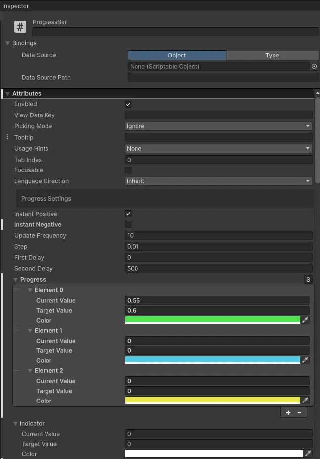
Attributes
| Attribute | Description |
|---|---|
| Progress Settings | |
| Instant Positive | If value increased Progress and Indicator changes will be shown instantly. |
| Instant Negative | If value negative Progress and Indicator changes will be shown instantly. |
| Update Frequency | interval in ms |
| Step | How much length progress bar moves per update. |
| First Delay | Delay before the first bar starts to move. First bar can be main bar or indicator bar, depending on the change. If change is negative, main bar moves first followed by indicator bar. If change in positive, indicator bar moves first followed by main bar. |
| Second Delay | Delay before the second bar starts to move. First bar can be main bar or indicator bar, depending on the change. If change is negative, main bar moves first followed by indicator bar. If change in positive, indicator bar moves first followed by main bar. |
| Use Time Scale | When enabled (default: true), animations respect Time.timeScale. Set to false for UI that should animate independently of game time (e.g., loading screens). |
| Progress | Multiple progress fills. |
| Indicator | Indicator fill, hidden under the progress fills. |
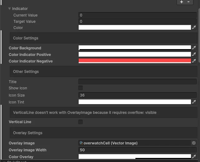
| Color Settings | |
| Color Background | Background color. |
| Color Indicator Positive | Color of the indicator bar when the change is positive. |
| Color Indicator Negative | Color of the indicator bar when the change is negative. |
| Other Settings | |
| Title | Text to display on the bar. |
| Show Icon | Show icon on left of the ProgressBar. |
| Icon Size | Width and height of the icon. |
| Icon Tint | Image tint for the icon. |
| Vertical Line | Make progress bar vertical instead of horizontal. |
| Overlay Settings | |
| Overlay Image | Image to use for overlay. Use SVG if you need masking. |
| Overlay Image Width | Width of the overlay image. Determines how many times it is repeated. |
| Gap Line Settings | |
| Gap Line Count | Number of cells. Gap lines drawn = count - 1. |
| Minor Cells Per Major | Number of minor cells per major segment. Major lines are drawn between major segments. |
| Minor Gap Line Width | Width of minor gap lines in pixels. |
| Minor Gap Line Color | Color of minor gap lines. |
| Minor Gap Line Range | Vertical range of minor gap lines as a Vector2 (X = start, Y = end, normalized 0 = bottom, 1 = top). (0,1) spans full height. |
| Minor Gap Line Min Spacing | Auto-skips minor lines when cells get too narrow. |
| Major Gap Line Width | Width of major gap lines in pixels. |
| Major Gap Line Color | Color of major gap lines. |
| Major Gap Line Range | Vertical range of major gap lines as a Vector2 (X = start, Y = end, normalized 0 = bottom, 1 = top). (0,1) spans full height. |
Progress Attributes
| Attribute | Description |
|---|---|
| CurrentValue | Clamp between 0-1. Current fill value. You don't wanna edit this directly. |
| TargetValue | Clamp between 0 and 1. This is the target fill value. Modify this to change the fill level, but simply editing it is not enough—you must also trigger an update. See the example below. |
| Color | Color of the progress bar. |
Custom USS Property
You can customize the appearance by overriding these USS properties in your stylesheet.
For quick styling, you can also use predefined color schemes by adding color classes. For example, adding a palette color class such as sky or red (the theme defines .ProgressBar.sky, .ProgressBar.red, etc.) will apply that family's progress-bar color settings.
Refer to colors to learn about available options.
| Property | Description |
|---|---|
| --progress-bar-bg-color | Sets the background color of the progress bar. |
| --progress-bar-indicator-positive-color | Defines the color of the indicator bar when displaying an increase in value. |
| --progress-bar-indicator-negative-color | Specifies the color of the indicator bar when displaying a decrease in value. |
| --progress-bar-progress-color-0 | Controls the color of individual progress bars. You can define up to 10 different progress colors (0-9) for multi-segment progress bars. |
Clay preset — progress-bar--clay
Add the progress-bar--clay class to opt the bar into the embossed clay look — transparent fill + luna-fx-clay effect (a shipped UI Effect) on each progress element. UXML-only opt-in, zero code at use sites.
<luna:ProgressBar class="hero-detail__xp progress-bar--clay" />The bar's OnAttach and end-of-RebuildProgressSegments hooks check for this class and apply the preset automatically:
- First segment's data
Colorset to transparent (so the effect shows through) - Each
.ProgressBar__progress-element's inlinebackground-colorcleared luna-fx-clayclass added to each progress elementUIEffectClassDriver.Attachcalled to wire the effect pipeline
Setting the fill value still uses the standard API — the clay preset is presentation-only:
bar.Progress[0].TargetValue = 0.6f;
bar.PlayProgress();

// Or the one-liner extension that bundles both:
bar.PlayTo(0.6f);
Colored clay variants come from per-bar USS overrides on the effect (
--luna-fx-grad-tone-1/2/3— top highlight, mid body, bottom shade), not from setting the segment's dataColor— the preset forces that to transparent. To tint a clay bar coral or violet, scope the USS override to the bar's own class:css.home-tab__season-bar { --luna-fx-grad-tone-1: var(--color-violet-300); --luna-fx-grad-tone-2: var(--color-violet-400); --luna-fx-grad-tone-3: var(--color-violet-500); }
The preset survives runtime RebuildProgressSegments calls — the rebuild internally calls ClearClassList() on each progress element, then ApplyClayPreset re-applies. If you toggle the progress-bar--clay class on the bar at runtime, call bar.RebuildProgressSegments() to refresh the preset state.
PlayTo(value) extension
Available on every ProgressBar via ProgressBarExtensions. Sets Progress[0].TargetValue and calls PlayProgress() in one call, with null safety:
public static void PlayTo(this ProgressBar progressBar, float value);Useful regardless of the clay preset:
root.Q<ProgressBar>("XPBar")?.PlayTo(0.824f);
root.Query<ProgressBar>(className: "stat-row__bar")
    .ForEach(b => b.PlayTo(0.65f));
Public Methods
RebuildProgressSegments
Must be called if you change Length of Progress array. Creates or removes progress bars.
public void RebuildProgressSegments()PlayProgress
Call to visually apply the values of Progress array.
public void PlayProgress()PlayIndicator
Call to visually apply the value of Indicator.
public void PlayIndicator()SetIndicatorStyle
This is handled automatically. But if you want, you can change the style of indicator fill manually.
public void SetIndicatorStyle(bool positive)SetFilling
There must be only one element in Progress array.
Useful for when you wanna highlight a change.
public void SetFilling(float current, float add, float max)

// Example:
// Suppose you have an Experience Bar and want to highlight gained EXP.
// You can call it as shown below to display both the current and gained values simultaneously.
experienceBar.SetFilling(currentExp, add, expRequiredForNextLevel);
SetOverlayRepeatAmount
The repeat amount of overlay image is controlled by OverlayImageWidth.
This function calculates and sets OverlayRepeatAmount based on the given repeatAmount and contentRect.width of the ProgressBar.
Warning: contentRect.width is not calculated during the initial frames. This function will only work after the first few frames.
public void SetOverlayRepeatAmount(int repeatAmount)SetGapLineCountWithScaling
Helper method that scales indicator and segment positions proportionally when gap count changes. Use this for dynamic max value scenarios (e.g., health bars where max HP changes).
When the maximum value changes (like max HP increasing from equipment), calling this method with the new gap count will automatically recalculate and reposition all segments and indicators proportionally.
public bool SetGapLineCountWithScaling(int newCount)Returns true if the gap line count changed, false if it stayed the same.
Gap Line Overlays
Gap lines are VisualElements positioned on top of progress fills, providing a cell-like appearance without the complexity of mesh-based rendering. This replaces the need for CelledProgressBar in most use cases.
Features
- Major and Minor Lines: Support for both major segment dividers and minor cell lines
- Auto-skip: Minor lines automatically hide when cells become too narrow
- Dynamic Scaling: Works with
SetGapLineCountWithScaling()for changing max values
Example: League of Legends Style Health Bar
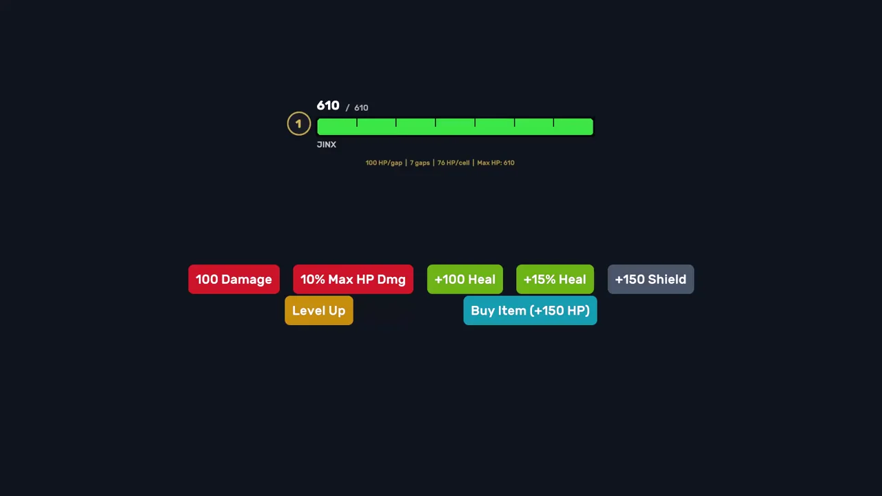
// Configure gap lines for a health bar where each cell represents 100 HP
private void SetupHealthBar(float maxHealth)
{
    int cellCount = Mathf.CeilToInt(maxHealth / 100f);
    _progressBar.GapLineCount = cellCount;
    _progressBar.MinorGapLineWidth = 2;
    _progressBar.MinorGapLineColor = new Color(0, 0, 0, 0.5f);
    _progressBar.MinorGapLineRange = new Vector2(0f, 1f); // Full height

    // Major lines every 1000 HP
    _progressBar.MinorCellsPerMajor = 10;
    _progressBar.MajorGapLineWidth = 4;
    _progressBar.MajorGapLineColor = Color.black;
}

// When max HP changes (e.g., from leveling up)
private void OnMaxHealthChanged(float newMaxHealth)
{
    int newCellCount = Mathf.CeilToInt(newMaxHealth / 100f);
    _progressBar.SetGapLineCountWithScaling(newCellCount);
}
Animation Completion Events
ProgressBar provides events that fire when animations complete, enabling event-driven sequencing without polling.
Events
| Event | Type | Description |
|---|---|---|
| OnSegmentAnimationComplete | Action<int, bool> | Fires when a segment animation completes. Parameters: segment index, whether positive change. |
| OnIndicatorAnimationComplete | Action<bool> | Fires when indicator animation completes. Parameter: whether positive change. |
Usage
// Subscribe to segment completion
_progressBar.Data.OnSegmentAnimationComplete += (segmentIndex, isPositive) =>
{
    Debug.Log($"Segment {segmentIndex} animation complete (positive: {isPositive})");
};

// Subscribe to indicator completion
_progressBar.Data.OnIndicatorAnimationComplete += (isPositive) =>
{
    Debug.Log($"Indicator animation complete (positive: {isPositive})");
};
Events fire in all completion paths: animated, instant, and zero-frequency.
Multi-Pass Animation
The PlayMultiPass() extension method animates through multiple full 0→100% cycles. This is useful for XP bars when gaining enough experience to level up multiple times.
Method Signature
public static void PlayMultiPass(
    this ProgressBar progressBar,
    float oldNormalized,  // Starting position (0-1)
    int passes,           // Number of full 0→100% passes
    float newNormalized,  // Final position (0-1)
    Action onComplete = null,
    Action<int> onPassComplete = null
)
Example: XP Bar with Multiple Level-Ups
// Player gains 350 XP, enough for 2 level-ups
int oldLevel = 5;
float oldXPNormalized = 0.7f;   // 70% into level 5

int newLevel = 7;
float newXPNormalized = 0.2f;   // 20% into level 7

int passes = newLevel - oldLevel;  // 2 full passes

_xpBar.PlayMultiPass(
    oldXPNormalized,
    passes,
    newXPNormalized,
    onComplete: () => Debug.Log("XP animation complete!"),
    onPassComplete: (passIndex) => Debug.Log($"Level up! Pass {passIndex}")
);
Other Multi-Pass Methods
// Cancel an active multi-pass sequence
_progressBar.CancelMultiPass();

// Check if multi-pass is currently running
bool isActive = _progressBar.IsMultiPassActive();
All bar animation settings (InstantPositive/Negative, FirstDelay, SecondDelay, Step, UpdateFrequency) are fully respected — only resets between passes are instant snaps.
CellTier (Automatic Cell Segmentation)
For advanced health bar implementations that change cell density based on max HP, use CellTier:
[Serializable]
public struct CellTier
{
    public float MaxValueThreshold;  // Upper bound for this tier
    public float MajorSegmentHP;     // HP per major segment
    public int MinorCellsPerMajor;   // Minor cells inside each major
}
Example: League of Legends Style Tiers
private CellTier[] _cellTiers = new[]
{
    new CellTier { MaxValueThreshold = 1000,  MajorSegmentHP = 100,  MinorCellsPerMajor = 1 },
    new CellTier { MaxValueThreshold = 2000,  MajorSegmentHP = 250,  MinorCellsPerMajor = 2 },
    new CellTier { MaxValueThreshold = 5000,  MajorSegmentHP = 500,  MinorCellsPerMajor = 5 },
    new CellTier { MaxValueThreshold = float.MaxValue, MajorSegmentHP = 1000, MinorCellsPerMajor = 10 }
};

private void UpdateHealthBar(float maxHP)
{
    CellTier tier = GetTierForValue(maxHP);
    int cellCount = Mathf.CeilToInt(maxHP / (tier.MajorSegmentHP / tier.MinorCellsPerMajor));

    _progressBar.GapLineCount = cellCount;
    _progressBar.MinorCellsPerMajor = tier.MinorCellsPerMajor;
}

private CellTier GetTierForValue(float maxValue)
{
    foreach (var tier in _cellTiers)
    {
        if (maxValue <= tier.MaxValueThreshold)
            return tier;
    }
    return _cellTiers[^1];
}
Example
using UnityEngine;
using UnityEngine.UIElements;

namespace CupkekGames.Luna.Demo.Components
{
  public class ProgressBarDemo : MonoBehaviour
  {
    private PanelRenderer _panelRenderer;
    private ProgressBar _progressBar;
    private Button _buttonDamage;
    private Button _buttonHeal;

    private void Awake()
    {
      // PanelRenderer delivers the visual tree asynchronously —
      // register a reload callback and query elements when it fires.
      _panelRenderer = GetComponent<PanelRenderer>();
      if (_panelRenderer != null)
      {
        _panelRenderer.RegisterUIReloadCallback(OnUIReload);
      }
    }

    private void OnUIReload(PanelRenderer renderer, VisualElement root, int version)
    {
      if (_progressBar != null) return; // sentinel: only init once

      _progressBar = root.Q<ProgressBar>();

      _buttonDamage = root.Q<Button>("Damage");
      _buttonHeal = root.Q<Button>("Heal");

      // Set instant to true to avoid animation at start
      _progressBar.InstantPositive = true;
      _progressBar.InstantNegative = true;

      _progressBar.Indicator.TargetValue = 1;
      _progressBar.PlayIndicator(); // You must call PlayIndicator to visually apply the value

      _progressBar.Progress[0].TargetValue = 1f;
      // Must be called after modifying the size of the Progress array. Not needed here, included for documentation purposes.
      _progressBar.RebuildProgressSegments();
      _progressBar.PlayProgress();  // You must call PlayProgress to visually apply the value

      // Set instant back to false to play animation
      _progressBar.InstantPositive = false;
      _progressBar.InstantNegative = false;

      // OnEnable ran before the UI arrived — re-run the subscriptions now.
      if (enabled) OnEnable();
    }

    private void OnDestroy()
    {
      if (_panelRenderer != null)
      {
        _panelRenderer.UnregisterUIReloadCallback(OnUIReload);
      }
    }

    private void OnEnable()
    {
      if (_buttonDamage == null) return;
      _buttonDamage.clicked += Damage;
      _buttonHeal.clicked += Heal;
    }

    private void OnDisable()
    {
      if (_buttonDamage == null) return;
      _buttonDamage.clicked -= Damage;
      _buttonHeal.clicked -= Heal;
    }

    private void Damage()
    {
      _progressBar.Progress[0].TargetValue -= 0.1f;
      _progressBar.Indicator.TargetValue = _progressBar.Progress[0].TargetValue;

      UpdateProgressBar();
    }

    private void Heal()
    {
      _progressBar.Progress[0].TargetValue += 0.1f;
      _progressBar.Indicator.TargetValue = _progressBar.Progress[0].TargetValue;

      UpdateProgressBar();
    }

    private void UpdateProgressBar()
    {
      _progressBar.RebuildProgressSegments();
      _progressBar.PlayProgress(); // Visually apply the value of progress bars

      _progressBar.PlayIndicator(); // Visually apply the value of the indicator bar
    }
  }
}
See also
- Progress Bar overview — component family hub
- Radial Progress Bar — circular arcs, multi-segment, partial-arc gauges
- RPG Demo — shader-driven custom visuals via
SetNodeUpdater - Architecture — data/controller internals, building custom bars
- UI Effects — the
luna-fx-clayeffect behind the clay preset
Settings
Theme
Light
Contrast
Material
Dark
Dim
Material Dark
System
Sidebar(Light & Contrast only)
Font Family
DM Sans
Wix
Inclusive Sans
AR One Sans
Direction