Button
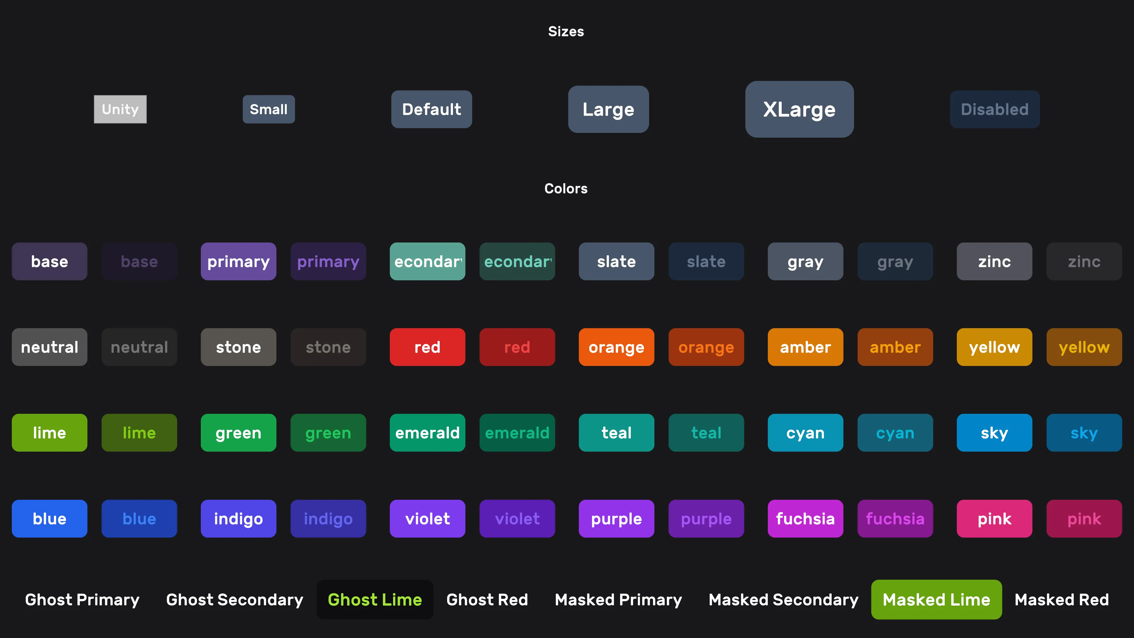
USS-styled variant of the built-in UnityEngine.UIElements.Button — no custom subclass. Add the btn class plus modifiers to get Luna's design-system look. Combine size, color, and visual-style classes freely.
Setup
xml
<ui:UXML xmlns:ui="UnityEngine.UIElements">
    <ui:Button class="btn" />
    <ui:Button class="btn btn-lg" />
    <ui:Button class="btn red" />
    <ui:Button class="btn btn-xl violet" />
    <ui:Button class="btn btn-xl violet ghost" />
    <ui:Button class="btn btn-xl violet masked" />
    <ui:Button class="btn btn-xl violet outline" />
</ui:UXML>
CSS classes
Size
| Class | Description |
|---|---|
btn | Required base class |
btn-sm | Small |
btn-lg | Large |
btn-xl | Extra-large |
Color
Add a color name as a class (no value). Available palette: see colors.
xml
<ui:Button class="btn teal" />Visual style
| Class | Description |
|---|---|
ghost | Transparent background, text/icon in the button-color. Hover/focus: text/icon shift to the hover tone — the background stays transparent. |
masked | Transparent background. Hover/focus: button-color class becomes the background; text color stays. |
outline | Border in the button-color class; text color matches the border. |
Animation
Buttons scale to 1.05 on hover/focus and 0.95 on press, with a 120ms ease-out transition. To opt out without changing any other styling, add no-scale.
| Class | Description |
|---|---|
no-scale | Disables the hover/focus/press scale animation. |
xml
<ui:Button class="btn violet no-scale" />See also
- UI Effects — glow, shine, and clay depth on buttons via the
luna-fxclasses (e.g.class="luna-fx luna-fx-btn luna-fx-clay yellow") - Input Prompt —
Buttonsubclass with input-icon support - Colors — full color palette
Settings
Theme
Light
Contrast
Material
Dark
Dim
Material Dark
System
Sidebar(Light & Contrast only)
Font Family
DM Sans
Wix
Inclusive Sans
AR One Sans
Direction
Left to RightLTR
Right to LeftRTL