First View
Assumes you've finished Quick Start (you know the Panel Settings → TSS chain) and know what UXML, USS, and a VisualElement are (covered in UI Toolkit Basics).
This walkthrough does one thing on purpose: shows that Luna's theme applies itself to standard UITK controls the moment you point a PanelRenderer at LunaPanelSettings. The end state is a brand-new scene with Luna-themed controls you wired from C# — no extra USS, no extra prefab, just standard <Label>, <Toggle>, and <Slider> picking up Luna's look automatically.
Before you build from scratch: Luna ships ready-made Views — Main Menu, Pause, Settings, Save & Load, Credits, Inventory, Dialogue. For full-screen flows, extending one of those is usually faster than authoring your own from zero. This page is the canonical "how do I write a custom view of my own?" walkthrough — useful either way, since extending a Luna view also means subclassing
UIViewComponent.
1. Set up the scene
Create a fresh scene (File > New Scene > Empty).
You need three things in the scene:
- LunaUIManager — drag
Assets/Samples/LunaUI/<version>/Essentials/Prefabs/LunaUIManager.prefabinto the scene. This GameObject hosts theLunaUIManagercomponent plus input wiring. Every view subscribes to it for focus management and input handling. See Luna UI Manager for what it does. - EventSystem — add
GameObject > UI > Event Systemif the scene doesn't have one yet. UI Toolkit input dispatch requires it. - Your view GameObject — create an empty GameObject (
GameObject > Create Empty), name itMyView, and add a Panel Renderer component to it (Add Component, search for "Panel Renderer").PanelRendereris the component that hosts a UXML tree in a scene — see UI Toolkit Basics for where it sits in the UXML/USS/Panel Settings composition.
⚠️ Naming warning. The Project-window create menu calls a
.uxmlasset a "UI Document" (Create > UI Toolkit > UI Document, step 2 below). That's a file in your project — the scene-side host is thePanelRenderercomponent you just added. From here on, this guide says "the PanelRenderer GameObject" for the scene object and "the.uxmlfile" for the asset.
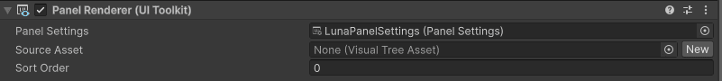
Select the PanelRenderer GameObject and fill its Inspector:
- Panel Settings: drag
Essentials/Theme/LunaPanelSettings.asset(screen-space) orLunaPanelSettingsWorldSpace.asset(world-space). This single reference is what wires Luna's full theme into your view — same chain you traced in Quick Start step 3. Anything you author from here on inherits the theme. - Source Asset: leave empty for now — you'll create a UXML file in step 2.
2. Create the UXML
Right-click in the Project view → Create > UI Toolkit > UI Document. Despite the menu wording, this creates a .uxml asset (a file in your project), not a scene GameObject. Name it MyView.uxml. Open it in UI Builder (double-click).
Add a VisualElement as a container, then drop in a Label, a Toggle, and a Slider from the Library panel. Give them names you can find from code:
- Label →
name: my-label, set text to "Hello, Luna" - Toggle →
name: my-toggle, set label to "Sound", check it on - Slider →
name: my-slider, set label to "Volume", range0–1, value0.6
About what you just added:
<Label>,<Toggle>, and<Slider>are standard Unity UI Toolkit controls — not Luna types. The Luna theme automatically styles standard UITK controls through the USS imported byLunaUIDemoTheme.tss: the Toggle's checkbox fills Luna's sky-blue with a slate border, the Slider gets a rounded slate track and a large sky-blue knob, and the Label picks up Luna's Nunito font — all without authoring any USS yourself. To use Luna's custom controls (ProgressBar,TabView,RadialLoading,Tooltip, …), drop them in from the Library too — they live under theCupkekGames.Lunanamespace and ship with the package.
⚠️ The Button is the one exception. Unlike the controls above, a plain
<Button>does not auto-skin — Luna's button look (slate fill, rounded corners, hover/focus, bold text) is gated behind an explicitclass="btn"(add a colour class likescarletfor a tint). So<Button class="btn" text="Click me" />is themed, while a classless<Button>stays Unity-default. Everything else on this page picks up the theme with no class at all.
⚠️ One outer element. Keep a single top-level
VisualElementwrapping everything (the container you added first).UIViewComponentauto-resolves its view root to the first top-level element of your UXML — with multiple top-level siblings it logs a warning and the others are left out of fades and transitions. One outer container sidesteps that entirely.
Save the file. Back on your PanelRenderer GameObject in the scene, assign MyView.uxml to its Source Asset field — that's what connects the asset to the scene.
If you press Play now, the label, toggle, and slider render with the Luna theme already applied — but they don't do anything yet, and nothing has wired UIViewComponent in.
3. Write the view script
The minimal version is genuinely small. Create Assets/Scripts/MyView.cs:
using CupkekGames.Luna;
using UnityEngine.UIElements;

public class MyView : UIViewComponent
{
    // Fires once, when the panel delivers the visual tree.
    protected override void OnUILoaded(VisualElement root)
    {
        var label = root.Q<Label>("my-label");
        var toggle = root.Q<Toggle>("my-toggle");
        toggle.RegisterValueChangedCallback(evt =>
            label.text = evt.newValue ? "Hello, Luna — sound on!" : "Hello, Luna — sound off!");
    }
}
Subclass UIViewComponent, override OnUILoaded, query your elements — that's the whole contract. The override exists because PanelRenderer builds the visual tree asynchronously: there is no root element to query in Awake(), so the base class hands you the root when it arrives.
Naming gloss —
UIViewComponentvsUIView.UIViewComponentis the MonoBehaviour you attach to the GameObject. Internally it creates and wraps aUIView— the plain C# object that owns the view root, fade, and actions — exposed via itsUIViewproperty (you'll use it in step 5). When these docs say "the view component", they mean the MonoBehaviour.
The minimal version has one gap: the value-changed handler is wired once and never unwired, so it ignores Unity's enable/disable lifecycle. The production-safe version below handles both delivery modes (asynchronous on standalone panels, synchronous during Awake() when the prefab is instantiated under an already-mounted shell) and cleans up after itself:
using CupkekGames.Luna;
using UnityEngine.UIElements;

public class MyView : UIViewComponent
{
    private Label _label;
    private Toggle _toggle;
    private Slider _slider;

    // PanelRenderer delivers the visual tree ASYNCHRONOUSLY — there is
    // no root element to query in Awake(). This hook fires exactly once,
    // when the tree first arrives. `root` is the view's root element.
    protected override void OnUILoaded(VisualElement root)
    {
        _label = root.Q<Label>("my-label");
        _toggle = root.Q<Toggle>("my-toggle");
        _slider = root.Q<Slider>("my-slider");

        // Wire the handlers for the first load. Unregister-then-register
        // keeps this idempotent (the Unregister is a safe no-op when not
        // subscribed): when the panel is already mounted — e.g. this prefab
        // instantiated under a shell — the tree is delivered SYNCHRONOUSLY
        // during Awake(), and OnEnable runs after this with the fields set.
        Rewire();
        UpdateLabel();
    }

    private void OnEnable()
    {
        // Null until the first load — OnUILoaded handles that case above.
        // Same Unregister/Register pattern: on synchronous delivery
        // OnUILoaded already subscribed during Awake(), so a bare Register
        // here would double-fire.
        if (_toggle == null) return;
        Rewire();
    }

    private void OnDisable()
    {
        if (_toggle != null) _toggle.UnregisterValueChangedCallback(OnToggleChanged);
        if (_slider != null) _slider.UnregisterValueChangedCallback(OnSliderChanged);
    }

    private void Rewire()
    {
        _toggle.UnregisterValueChangedCallback(OnToggleChanged);
        _toggle.RegisterValueChangedCallback(OnToggleChanged);
        _slider.UnregisterValueChangedCallback(OnSliderChanged);
        _slider.RegisterValueChangedCallback(OnSliderChanged);
    }

    private void OnToggleChanged(ChangeEvent<bool> _) => UpdateLabel();
    private void OnSliderChanged(ChangeEvent<float> _) => UpdateLabel();

    private void UpdateLabel()
    {
        string sound = _toggle.value ? "on" : "off";
        _label.text = $"Hello, Luna — sound {sound}, volume {_slider.value:0.00}";
    }
}
Attach this script to the PanelRenderer GameObject from step 1. Since MyView is a UIViewComponent subclass, adding it also adds the UIViewComponent plumbing automatically.
Inspector defaults you can leave as-is:
- Panel Renderer — auto-fetches from the same GameObject (or any parent) if left empty.
- Parent Name — leave empty to use your UXML's outer element as the view root; set to a
VisualElementname to scope the view to a sub-tree. - Focus Name — element to focus when the view fades in (used for keyboard navigation).
- Fade Duration / Easing Mode — fade animation.
0.5/EaseOutCircis the Luna default. - Fade In Delay / Fade Out Delay — optional delay (seconds) before each fade starts.
0by default.
Press Play. The view appears immediately — a standalone view (one not driven by navigation) is born visible; toggling Sound or dragging Volume updates the label; everything wears the Luna theme without a single line of USS in your project.
4. Show, hide, and fade events
UIViewComponent exposes Show() and Hide() — they run the fade-in / fade-out animation on the view root:
Hide();   // fade out; the element ends at display: none, GameObject stays active
Show();   // fade back in
There is no "fade out then destroy" helper — for an on-demand view, Hide() it and Show() it again later, or let the navigation stack pop it (navigation destroys multi-instance copies after fade-out for you).
For state-aware logic, subscribe to fade events on the Fade property — a FadeUIElement. Like the element queries, this has to wait for the UI to load (Fade is null before then). WhenUILoaded runs your code immediately if the UI is already loaded, otherwise as soon as it is:
private void Start()
{
    WhenUILoaded(() =>
    {
        Fade.OnFadeIn  += OnFadedIn;
        Fade.OnFadeOut += OnFadedOut;
    });
}

private void OnFadedIn()  { /* view fully visible */ }
private void OnFadedOut() { /* view fully hidden */ }
5. Close with Esc
Views close on Escape through UI Actions — add a UIViewActionEscape to the view's UIView. The action registers itself while the view is visible and unregisters when it fades out, so stacked views unwind in the right order:
protected override void OnUILoaded(VisualElement root)
{
    // ... element queries from step 3 ...

    UIView.AddAction(new UIViewActionEscape(Hide));
}
(From outside the component you'd wrap it the same way: myView.WhenUILoaded(() => myView.UIView.AddAction(new UIViewActionEscape(myView.Hide)));)
For modal-style views that open on demand and full-screen views that stack (Main Menu → Settings → Credits), use the navigation system — destinations declared in a nav graph get push/pop, backdrops, and Esc-to-pop without hand-wiring. The pre-built Views (Main Menu / Pause / Settings / Save & Load) are all UIViewComponent subclasses you can extend.
For a complete multi-page UI example, see Example: Multi Page UI.
What you just proved
The whole point of this walkthrough: Luna's theme is one Panel Settings reference away from any UXML you author. You didn't write any USS, didn't drag any prefab into your UXML, didn't subclass anything Luna-specific from your UXML side — and yet the result wears the Luna look, animates show/hide, hooks into focus management, and is ready to participate in navigation.
Recommended next: Views. Main Menu, Pause, Settings, Save & Load, Inventory, Credits, Dialogue — most projects extend one of these pre-built screens instead of authoring from scratch, and each one is a UIViewComponent subclass exactly like the view you just wrote.
Also useful from here:
- Custom components — Components section has per-component pages for Luna's drop-in widgets: ProgressBar, RadialLoading, Tooltip, TabView, PieChart, CooldownWipe, etc.
- Effects — Transition Animation for entry/exit motion; UI Effects for glow / outline / shadow / gradient via USS.
- UI Actions — UI Actions — a slot-based action system for view-level behaviors (escape handling, hotkey wiring).
Settings
Theme
Light
Contrast
Material
Dark
Dim
Material Dark
System
Sidebar(Light & Contrast only)
Font Family
DM Sans
Wix
Inclusive Sans
AR One Sans
Direction