Components Guide
How Luna's component system works — the structural pattern that makes "swap one class to recolor" possible, and the two kinds of components you'll find.
Want a single scene that previews most components at once? Open
LunaStorybook.unity(in the Showcase sample). Want a guided walkthrough? Read the First View.
Two kinds of components
Luna ships two flavours of UI control, both stylable the same way:
1. Built-in restyles
Unity's UIElements controls (Button, Slider, Toggle, Dropdown, ListView, TabView, TextField, RadioButtonGroup) restyled via USS — no custom subclass, no new C# type. You use the standard Unity element in your UXML:
<engine:Button text="Buy" />
<engine:Slider direction="Horizontal" />
<engine:Toggle label="Mute" />
Luna's USS adds the Luna theme. Your existing UXML continues to work; Luna doesn't fork the underlying control.
2. Custom Luna components
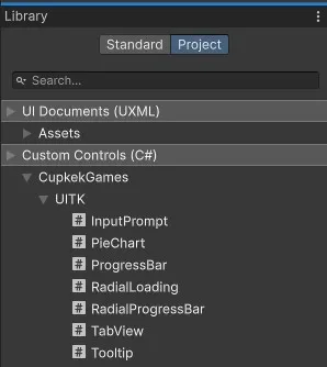
Net-new controls Luna defines from scratch: ProgressBar, RadialProgressBar, Tooltip, InputPrompt, PieChart, Tabview (custom variant), Pagination, RadialLoading, CooldownWipe, CircleHoleElement. These live under the cupkek UXML namespace:
<cupkek:ProgressBar progress="0.4" />
<cupkek:RadialProgressBar progress="0.65" />
<cupkek:Tooltip text="Lorem ipsum" />
To add custom components in UI Builder: select Project in the Library section → unfold CupkekGames → drag any component into the Hierarchy.
The structure-vs-color-class pattern
Every Luna component (built-in restyle or custom) follows the same recolor pattern:
[ component class ]  +  [ color class ]
       ↓                       ↓
   structure              palette routing
   padding,               --btn-bg,
   border-radius,         --btn-bg-hover,
layout --btn-border-disabled, …- Structure class (
btn,unity-toggle,component-progress-bar, …) — defines padding, border-radius, layout, animations. - Color class (
red,blue,coral,slate, …) — routes the palette tokens (--color-red-400, etc.) into the component's internal CSS variables.
In UXML:
<engine:Button class="btn red"   text="Buy" />
<engine:Button class="btn coral" text="Cancel" />
<engine:Toggle class="unity-toggle violet" label="Notifications" />
<cupkek:ProgressBar class="component-progress-bar emerald" progress="0.6" />
Switch a component's color by changing one class — no per-element style overrides.
Where does the routing come from? Essentials ships it out of the box — the sample theme's Colors/component-colors.uss (and its -neutral sibling) defines a .btn.{color}-style block for every control and every shipped ramp, already @imported by the demo TSS, so class="btn red" works the moment the sample is in. When you build your own palette, the Palette Generator re-exports that same routing as per-component templates — UButton_Colors.uss, USlider_Colors.uss, etc. — which you @import into your TSS; see Palette Export for the round-trip.
State via USS classes (not inline style)
For dynamic state (active / disabled / responsive breakpoints / locale), add/remove a class — let the stylesheet describe the state:
btn.AddToClassList("active");
btn.RemoveFromClassList("active");
btn.EnableInClassList("disabled", isDisabled);.btn.active { background-color: var(--color-blue-700); }
.btn.disabled { opacity: 0.5; }Pervasive Luna patterns: .breakpoint-lg (responsive layouts), .locale-ja (locale switches), drag-state classes, hover/focus pseudo-classes. See UI Toolkit Basics for the underlying USS pattern.
See also
- Colors — the
--color-{name}-{tone}token system + the three Palette-Generator export categories - Theme Stack — how component USS sits in the broader
@importchain - Palette Export — generate a custom palette + component templates from the web tool
- First View — write your first
UIViewComponentand wire a button click - Component pages in the sidebar — per-component setup, classes, and examples
Settings
Theme
Light
Contrast
Material
Dark
Dim
Material Dark
System
Sidebar(Light & Contrast only)
Font Family
DM Sans
Wix
Inclusive Sans
AR One Sans
Direction