UI Effects
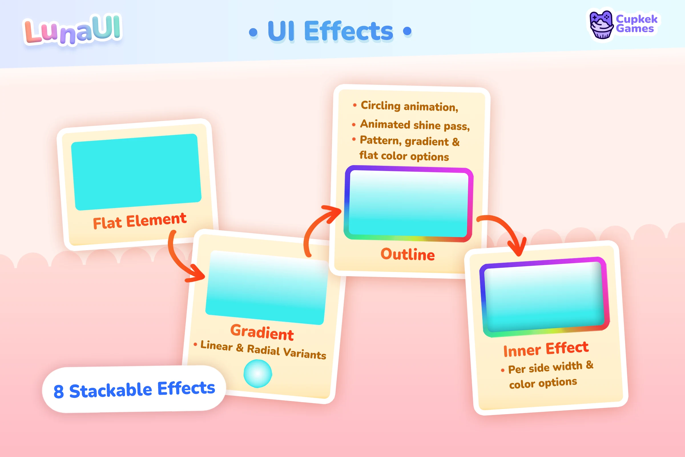
Luna's UI Effects system adds composable shader-based visual effects to any UI Toolkit VisualElement — drop shadows, glows, insets, outlines, gradients, shine sweeps, flash pulses, tiled patterns, dissolves. Authoring is USS-driven: an element opts in with the luna-fx marker class, then tier / body / fill classes layer the look. C# exists as an imperative escape hatch but isn't the recommended path.
Quick start
⚠️ Step 0 — assign
UIEffectSettingsor nothing renders. Set the asset onLunaUIManager's Effect Settings field; without it the filter pipeline stays uninitialised and no effects draw. Create one via Assets > Create > CupkekGames > Luna UI > UI Effect Settings and point it at the EssentialsEffects/LunaFilter.asset; full detail in Setup.
From there, authoring is just classes in UXML:
<!-- A shadowed, glossy yellow button -->
<engine:Button class="luna-fx luna-fx-btn luna-fx-clay yellow"
text="Forge"/><!-- A card with a soft drop shadow -->
<engine:VisualElement class="luna-fx luna-fx-shadow-md"/><!-- Pulse-glowing chip -->
<engine:VisualElement class="luna-fx luna-fx-glow-md luna-fx-pulse cyan"/>If you have LunaUIManager in the scene with Auto Install Fx enabled (the default), every UIView automatically wires its descendants — no extra setup. The first class is always luna-fx; everything else is composable.
Effect catalog
Eight effects, all running through one hand-written HLSL uber shader (Hidden/Luna/UberFilter). Each effect is gated by an _ActiveEffects bitmask uniform — disabled effects branch out at runtime and cost almost nothing.
| Effect | Class hint | Use it for |
|---|---|---|
| Outer | luna-fx-shadow-*, luna-fx-glow-*, luna-fx-ring | Drop shadow, halo glow, colored rim |
| Outline | (auto in default stack) | Crisp border, dashed/dotted/circling/shine border |
| InnerOverlay | luna-fx-inset-*, luna-fx-track, luna-fx-rim-bottom | Recessed/embossed look, claymorphic depth, side-mask rims |
| Gradient | luna-fx-clay, luna-fx-bar, luna-fx-matte, luna-fx-rainbow, luna-fx-aurora, luna-fx-holo, … | Surface fill, linear/radial CSS gradients |
| Shine | luna-fx-shine | Animated sweeping highlight (linear or radial) |
| Flash | luna-fx-pulse | Periodic full-element flash/breathe |
| Tile | --luna-fx-tile-image | Tiled texture overlay (animated, with reveal/coverage) |
| Dissolve | --luna-fx-dissolve-rate | Edge-banded dissolve / appear / disappear effect |
The default stack always includes Outer + Outline. The other six are lazy-stacked the first time their marker variable resolves on the element — so a card that only uses luna-fx-shadow-md never pays for the Shine or Tile slots.
Predefined classes
Ship with Luna out of the box. Use them as building blocks; combine freely.
Marker
| Class | Effect |
|---|---|
luna-fx | Required. Opts the element into the system. |
Tier classes — drop shadow / outer halo
Outer effect. Six tier sizes per family.
| Class family | Sizes | Use |
|---|---|---|
luna-fx-shadow-* | xs, sm, md, lg, xl, 2xl | Black drop shadow under the element |
luna-fx-glow-* | xs, sm, md, lg, xl, 2xl | Palette-colored halo (pulls from --luna-fx-grad-tone-2) |
Glow tiers also bump strength on :hover automatically.
Tier classes — inner overlay (claymorphic depth)
InnerOverlay effect. Six tier sizes.
| Class | Use |
|---|---|
luna-fx-inset-xs … luna-fx-inset-2xl | Recessed/embossed inner shadow on all four edges |
luna-fx-rim-bottom | Side-mask modifier — pair with an inset tier; only the bottom rim renders. Signature "card lip" depth. |
Body classes — multi-effect bundles
Each body bundles outer + inner + outline overrides for a typical UI shape.
| Class | What it is |
|---|---|
luna-fx-btn | Tight drop shadow + bottom-heavy inset, with built-in :hover / :active / :disabled state values |
luna-fx-track | Recessed rail (top-heavy inset) — progress-bar bg, slot bg |
luna-fx-banner | Bottom-edge inset + soft cast — modal headers, accent strips |
luna-fx-ring | Palette-colored halo + thin inner highlight — portrait frames |
Fill classes — gradient surface
Gradient effect. Each sets --luna-fx-gradient to a CSS gradient string referencing --luna-fx-grad-tone-1/2/3. Always combine with a color binding — the plain yellow color class on a luna-fx element (the .luna-fx.{color} binding) — so the tones resolve.
| Class | Look |
|---|---|
luna-fx-clay | 4-stop vertical "puffy clay" |
luna-fx-bar | 3-stop horizontal with end-cap (progress fills) |
luna-fx-matte | Near-flat 2-stop |
Color bindings — .luna-fx.{color}
The palette tones the effects pull from — --luna-fx-grad-tone-1/2/3 plus the glow, inner, shine, and flash colors — are routed by color binding classes in the compound form .luna-fx.{color}: a plain palette word that only activates on elements carrying the luna-fx marker.
<engine:Button class="luna-fx luna-fx-btn luna-fx-clay yellow" text="Forge"/>The yellow here is the same palette word that drives class="btn yellow" elsewhere — one color vocabulary across components and effects. Each binding sets the three gradient tones (with hover/active steps for the state tween) plus the inner-overlay, shine, and flash colors from that ramp.
Where the classes come from:
- Shipped in Essentials —
Theme/Colors/component-colors.ussdefines.luna-fx.{color}blocks for all 32 chromatic ramps:red,scarlet,crimson,ruby,rose,pink,magenta,fuchsia,purple,violet,lavender,indigo,navy,cobalt,blue,azure,sky,cyan,turquoise,teal,mint,jade,emerald,green,forest,lime,yellow,gold,amber,orange,peach,coral.component-colors-neutral.ussadds theslate/neutral/stoneversions. - Re-exportable via the Palette Generator — the web tool's
UIEffect_Colors.usscomponent template regenerates the same routing for your own custom palette.
See Colors for the full palette system and the export round-trip.
Composable modifiers
| Class | Effect |
|---|---|
luna-fx-shine | Animated sweeping highlight |
luna-fx-pulse | Flash/breathe pulse |
Flair classes (Essentials theme)
The Essentials sample ships extra opinionated presets in UIEffect_Flair.uss:
- Multi-stop gradients:
luna-fx-rainbow,luna-fx-sunset,luna-fx-aurora,luna-fx-holo,luna-fx-candy,luna-fx-orb,luna-fx-spotlight,luna-fx-vignette - Animated outlines:
luna-fx-rainbow-outline,luna-fx-candy-outline,luna-fx-gold-outline,luna-fx-silver-outline,luna-fx-bronze-outline - Outline patterns:
luna-fx-scan,luna-fx-stripes,luna-fx-dots,luna-fx-hearts,luna-fx-stars,luna-fx-dashed-10,luna-fx-dashed-20
These are sample-side; copy what you like into your project's USS.
USS variables
The full --luna-fx-* vocabulary, by effect. Every variable supports var(), :hover / :active / :disabled selectors, and theme tokens. Suffixed variants (-hover, -active, -disabled) on the animatable scalars are picked up by the auto-attached state-tween for smooth transitions.
Outer (drop shadow / halo)
| Variable | Type | Notes |
|---|---|---|
--luna-fx-outer-strength | float | 0 = dormant. Animatable. |
--luna-fx-outer-width | float | Pixel reach. Animatable. |
--luna-fx-outer-edge-spread | float | Soft falloff from element edge. |
--luna-fx-outer-offset-x | float | Horizontal offset (px). |
--luna-fx-outer-offset-y | float | Vertical offset (px). Positive = down. |
--luna-fx-outer-color | color | Halo color. Use var(--luna-fx-grad-tone-2) for palette-tinted glow. |
Outline
| Variable | Type | Notes |
|---|---|---|
--luna-fx-outline-width | float | Pixel width. 0 = dormant. |
--luna-fx-outline-opacity | float | 0 = dormant (animatable). |
--luna-fx-outline-color | color | |
--luna-fx-outline-softness | float | 0 = crisp, higher = blurred edge. |
--luna-fx-outline-pattern-image | sprite | URL/resource. Tints into the outline (dashed, hearts, …). |
--luna-fx-outline-pattern-scale | float | |
--luna-fx-outline-pattern-opacity | float | |
--luna-fx-outline-pattern-tint | color | |
--luna-fx-outline-dash-count | float | 0 = solid; non-zero gives dashed segments. |
--luna-fx-outline-dash-ratio | float | Dash : gap ratio. |
--luna-fx-outline-circling-speed | float | Animated rotation speed. |
--luna-fx-outline-shine-speed | float | Travelling-shine speed. |
--luna-fx-outline-shine-size | float | Travelling-shine band size. |
--luna-fx-outline-shine-color | color | |
--luna-fx-outline-gradient | string | CSS gradient applied to the outline (e.g. rainbow ring). |
InnerOverlay (recessed / embossed)
| Variable | Type | Notes |
|---|---|---|
--luna-fx-inner-opacity | float | 0 = dormant (animatable). |
--luna-fx-inner-softness | float | Edge blur. |
--luna-fx-inner-color | color | Default semi-transparent black. |
--luna-fx-inner-width | float | Shorthand — sets all four edges. |
--luna-fx-inner-width-left | float | Per-edge override. |
--luna-fx-inner-width-top | float | Per-edge override. |
--luna-fx-inner-width-right | float | Per-edge override. |
--luna-fx-inner-width-bottom | float | Per-edge override. |
Gradient (surface fill)
| Variable | Type | Notes |
|---|---|---|
--luna-fx-gradient | string | CSS gradient string. References to --luna-fx-grad-tone-* resolve at draw time, so palette swaps re-tint without re-parsing. |
--luna-fx-gradient-opacity | float | |
--luna-fx-gradient-angle | float | Linear gradients only. |
--luna-fx-gradient-type | float | 0 = Linear, 1 = Radial. |
--luna-fx-gradient-reverse | float | 0 / 1. |
--luna-fx-gradient-color-bias | float | Push midpoint of two-stop gradients. |
--luna-fx-grad-tone-1/2/3 | color | The three tones a fill class references. Set by palette/color-binding classes. |
Shine (animated highlight sweep)
| Variable | Type | Notes |
|---|---|---|
--luna-fx-shine-opacity | float | 0 = dormant. |
--luna-fx-shine-color | color | |
--luna-fx-shine-width | float | Band width (0–1 of element). |
--luna-fx-shine-angle | float | Degrees. |
--luna-fx-shine-cycle-time | float | Seconds per loop. |
--luna-fx-shine-sweep-angle | float | Total arc the shine traverses. |
--luna-fx-shine-mode | float | 0 = Linear, 1 = Radial. |
Flash (pulse / breathe)
| Variable | Type | Notes |
|---|---|---|
--luna-fx-flash-intensity | float | 0 = dormant (animatable). |
--luna-fx-flash-color | color | |
--luna-fx-flash-speed | float | Hz. |
Tile (texture overlay)
| Variable | Type | Notes |
|---|---|---|
--luna-fx-tile-image | sprite | Required to light up. |
--luna-fx-tile-opacity | float | 0 = dormant. |
--luna-fx-tile-color | color | |
--luna-fx-tile-scale | float | |
--luna-fx-tile-rotation | float | Degrees. |
--luna-fx-tile-rate | float | Animation rate. |
--luna-fx-tile-speed | float | Translation speed. |
--luna-fx-tile-coverage-start | float | Reveal start (0–1). |
--luna-fx-tile-coverage-end | float | Reveal end (0–1). |
--luna-fx-tile-coverage-start-softness | float | |
--luna-fx-tile-coverage-end-softness | float | |
--luna-fx-tile-cell-zoom-start | float | |
--luna-fx-tile-cell-zoom-end | float | |
--luna-fx-tile-full-reveal | float |
Dissolve
| Variable | Type | Notes |
|---|---|---|
--luna-fx-dissolve-rate | float | 0 = dormant. Animate to 1 to fully dissolve. |
--luna-fx-dissolve-image | sprite | Optional — built-in noise pattern is the fallback. |
--luna-fx-dissolve-color | color | Edge-band tint. |
--luna-fx-dissolve-width | float | Edge-band width. |
--luna-fx-dissolve-softness | float | |
--luna-fx-dissolve-scale | float | Pattern scale. |
State-aware authoring
Append -hover, -active, or -disabled to any animatable scalar to declare its target state value. The auto-attached UIEffectStateTween interpolates smoothly:
.my-card {
    --luna-fx-outer-strength: 0.5;
    --luna-fx-outer-strength-hover: 0.9;       /* tweens to here on hover */
    --luna-fx-outer-strength-active: 0.3;
    --luna-fx-outer-strength-disabled: 0.2;
}
Pseudo-class selectors (:hover, :active, :enabled, :disabled) work too and snap immediately. luna-fx-btn uses both: suffix vars for the tween, pseudo-class forwarders so non-tweened renderers still snap correctly.
Setup
Auto-install (default)
In LunaUIManager Inspector:
- Auto Install Fx —
trueby default. EveryUIViewautomatically callsUIEffectPanelHook.Install(view.ParentElement, "luna-fx")on attach, so all descendants carrying the marker class get wired up. No code needed.
Manual install
For raw PanelRenderer use (no UIView), or to gate which subtrees are eligible, install inside the renderer's reload callback — PanelRenderer delivers its visual tree asynchronously:
using CupkekGames.Luna.Effects;
using UnityEngine;
using UnityEngine.UIElements;

public class FxInstaller : MonoBehaviour
{
    [SerializeField] private PanelRenderer _panelRenderer;

    void Awake()
    {
        _panelRenderer.RegisterUIReloadCallback(OnUIReload);
    }

    void OnDestroy()
    {
        _panelRenderer.UnregisterUIReloadCallback(OnUIReload);
    }

    private void OnUIReload(PanelRenderer renderer, VisualElement root, int version)
    {
        UIEffectPanelHook.Install(root, UIEffectClassDriver.DefaultMarkerClass);
    }
}
Install is idempotent on the same root, so re-running it on every reload is safe. It also cleans up after itself: when an installed root detaches from its panel the hook auto-uninstalls, and a one-shot re-attach watcher re-installs the same root if it ever returns to a panel — effects self-recover across panel rebuilds without manual Uninstall bookkeeping.
The marker class must be present before the element enters the panel for auto-pickup. If you toggle the marker after attach, call UIEffectClassDriver.Attach(element) directly.
Without a LunaUIManager, you must also register the effect settings yourself — the filter pipeline stays uninitialised until something calls:
UIEffectSettings.SetInstance(settingsAsset);LunaUIManager makes this call automatically in Awake when present; only manager-less setups need it.
UIEffectSettings asset (required)
Create a UIEffectSettings asset (Assets > Create > CupkekGames > Luna UI > UI Effect Settings) and assign the Luna FilterFunctionDefinition asset (the Essentials sample ships one: Effects/LunaFilter.asset, which references the Hidden/Luna/UberFilter shader). Then assign the settings asset to LunaUIManager's Effect Settings field — the manager calls UIEffectSettings.SetInstance in Awake. Without it the filter pipeline is uninitialised and no effects render.
Samples
The Showcase sample ships three Effects scenes:
Components/Effects/EffectsShowcase.unity— gallery of every preset class on every base shape. Browse this first.Components/Effects/EffectsPresets.unity— preset cards isolated for screenshot grids.Components/Effects/EffectsPlayground.unity— interactive playground. Toggle effects, scrub uniforms, see the shader uniforms update live.
UIEffect_Flair.uss (Samples~/Essentials/Theme/UIEffect_Flair.uss in the imported Essentials sample) is the source for the multi-stop / animated-outline classes listed above — copy what you like.
How it works
- The
luna-fxmarker class hooks the element intoUIEffectClassDriver. The driver builds a default stack (Outer + Outline, both dormant) and registersCustomStyleResolvedEventto react to USS changes. - Tier / body / fill classes are pure parameter bundles — they only write
--luna-fx-*variables. They never replace the stack, so every combination composes naturally. - On every style resolve,
LunaEffectUSSOverridesreads the resolved--luna-fx-*values from the element'scustomStyleand writes them into the shader's MaterialPropertyBlock — overriding whatever the C# stack baked. USS is always the final word. - InnerOverlay / Shine / Flash / Tile / Dissolve are stacked lazily — only when their marker variable resolves. Elements that never need them stay on the minimal Outer + Outline stack.
- Gradient strings (
--luna-fx-gradient,--luna-fx-outline-gradient) are parsed once into a retained template; pseudo-state tone shifts re-resolvevar()references without re-parsing. - The shader is one hand-written HLSL transparent uber shader (
Hidden/Luna/UberFilter). Each effect is gated by an_ActiveEffectsbitmask uniform — disabled effects branch out at runtime and cost almost nothing.
Opacity & visibility
Luna effects respect the standard UITK visibility properties — opacity, visibility, and display — including ancestor inheritance. A faded parent fades its filtered children's gradients, glows, shadows, shines, and every other decorative pass uniformly with the element's own content.
How Luna handles it
Every frame the filter pass runs, Luna walks the target up its hierarchy and folds the result into a single _LunaElementOpacity shader uniform:
resolvedStyle.opacityon each ancestor is multiplied together (cumulative).- Any ancestor with
display: noneorvisibility: hiddencollapses the value to0.
The shader multiplies its final composited output by this uniform. Decorative passes (gradient, outer glow/shadow, shine, flash, tile, etc.) don't read element content — they generate pixels directly — so without this multiply they would render at full intensity even when the element's own content is faded by UITK's pre-multiplied opacity.
The walk happens inside the filter pass's per-frame OnApplySettings callback, so:
- Opacity transitions animate correctly. UITK lerps
resolvedStyle.opacitynatively; Luna picks up the live value every frame and the shader fades smoothly with the element. - Display flips are free. When the target or an ancestor goes
display: none, the filter pass itself is detached (no SetPass cost).GeometryChangedEventfires on the toggle back, re-attaches automatically.
Gotcha: UITK's native filter: blur() and filter: drop-shadow()
opacity on an ancestor doesn't reach UITK-filtered subtrees through the cascade. UITK renders each element with style.filter into an isolated pass, and that pass's output is composited back without ancestor opacity propagation. This is UITK behavior, not Luna behavior — Luna's own filter pass works around it via _LunaElementOpacity, but native blur / drop-shadow use Unity's built-in filter pipeline which Luna can't reach.
Symptom: you fade a screen with opacity: 0.1 on a parent, every element fades except one — a stubborn dark rectangle from a blurred backdrop, or a leftover drop-shadow.
Fix: write inline opacity directly on the filtered element, not an ancestor.
/* ✗ Doesn't fade — UITK filter isolation breaks the cascade. */
.modal-container { opacity: 0.1; }
.modal-container .scrim-bg { filter: blur(8px); background-color: rgba(0,0,0,0.4); }

/* ✓ Fades — write opacity on the filtered element itself. */
.modal-container .scrim-bg.fading { opacity: 0.1; }// Or in C# — set the inline opacity on the filtered element:
scrimBg.style.opacity = 0.1f;Alternative: animate the filter parameter to zero instead of opacity. filter: blur(0px) produces no visible blur. This avoids the isolation entirely.
If you author Luna effects exclusively, you'll never hit this — Luna's pipeline handles ancestor opacity correctly. The gotcha applies only when you mix in UITK's native filter functions.
Imperative C# API (escape hatch)
For dynamic cases that don't fit USS — gameplay-driven effects, pooled VFX overlays, programmatic preview tools — the C# API is unchanged:
using CupkekGames.Luna.Effects;

// Direct API
var fx = new UIEffectElement(myElement);
fx.AddEffect(new OuterEffect { Color = Color.red, Strength = 1f, Width = 12f });
fx.AddEffect(new ShineEffect { Opacity = 0.4f, Width = 0.1f });
fx.RefreshEffects();

// One-off override on a USS-driven element (pinned over the dormancy gate).
// Returns false if the element lacks the luna-fx binding.
LunaEffectOverride.SetFloat(myElement, "--luna-fx-outer-strength", 1.5f);
LunaEffectOverride.SetColor(myElement, "--luna-fx-outer-color", Color.red);
Most projects don't need this — the USS path covers static styling, hover/active states, theme swaps, and palette tinting. Reach for C# only when the effect parameters genuinely need to live in code.
Performance
- Default stack is two effects (Outer + Outline). The other six lazy-attach only when their USS marker resolves — pay only for what you author.
- The
--luna-fx-*resolved set is cached per element and rebuilt onCustomStyleResolvedEvent. The per-frame write path iterates only the resolved bindings, not the full vocabulary. - Effects are gated by the
_ActiveEffectsbitmask uniform in the uber shader. Disabled effects branch out at runtime and cost almost nothing. - The state-tween manipulator self-discovers suffix vars on first style-resolve and stays dormant if none are present.
- Animated effects (shine sweeps, flash pulses, state tweens, per-frame repaints via
UIEffectElement.StartAnimation) are driven by one global Luna ticker at a fixed ~16ms cadence — a single scheduled task fans out to every animated element instead of one scheduler per element. Per-element interval parameters (e.g.StartAnimation(intervalMs)) are retained for API compatibility but ignored. - Effects self-recover after panel detach/re-attach: an installed root that leaves its panel auto-uninstalls its hook and re-installs when the same root re-attaches — no per-screen lifecycle code needed.
- For purely static decorations (fixed cards, panels, frames), see UI Effect Baking — the editor tool pre-renders the stack to a 9-slice PNG so the element renders as a regular sprite with a single batch.
Troubleshooting
| Symptom | Fix |
|---|---|
| No effects visible | LunaUIManager in scene? Auto Install Fx enabled? Element has the luna-fx marker class? Element has non-zero size? |
Background is washed-white / blank when using luna-fx-shadow-* | The element has overflow: hidden. Either drop it, or pair with a fill class (luna-fx-clay / matte / bar) and a color binding so the gradient paints the surface. |
| Glow renders black | --luna-fx-grad-tone-2 isn't set. Apply a color class on the luna-fx element (yellow, etc. — the .luna-fx.{color} binding) or set --luna-fx-outer-color directly. |
| Filter pipeline uninitialised (no effects render) | Create the UIEffectSettings asset, assign the Luna FilterFunctionDefinition asset, and assign the settings asset to LunaUIManager's Effect Settings field (see Setup). |
| Marker class added at runtime not picked up | Call UIEffectClassDriver.Attach(element) manually — auto-pickup only fires for elements that carry the marker on panel-attach. |
Parent opacity fades the screen but one filtered element stays visible | Element has UITK's native filter: blur() / filter: drop-shadow(). UITK isolates filter passes from the opacity cascade — write inline opacity directly on the filtered element, or animate the filter parameter to zero instead. See Opacity & visibility. |
See also
- UI Effect Baking — pre-render static stacks to 9-slice PNGs for one-draw-call cards and panels.
- Colors — the palette system behind the
.luna-fx.{color}bindings. - Transition Animation — the motion layer to pair with these looks: 53 presets + a fluent builder.
All eight effects ship with Luna — get it on the Asset Store.
Settings
Theme
Light
Contrast
Material
Dark
Dim
Material Dark
System
Sidebar(Light & Contrast only)
Font Family
DM Sans
Wix
Inclusive Sans
AR One Sans
Direction