Radial Progress Bar
Progress Bar family — one shared animation core (ProgressBarData + ProgressBarController), several shapes on top.
This page is the radial variant's full reference; siblings: Overview · Linear · RPG Demo · Architecture.
RadialProgressBar is a circular progress indicator that renders arcs using UI Toolkit's mesh generation API. It supports multi-segment displays (like Overwatch-style health bars), smooth animations, indicator overlays, and configurable arc spans for speedometer-style gauges.
Quick start
⚠️ Give it an explicit size. The element paints its own arcs, so without
width/heightthere is nothing to draw into and the bar renders blank.
<ui:UXML xmlns:ui="UnityEngine.UIElements" xmlns:luna="CupkekGames.Luna">
    <luna:RadialProgressBar name="health-radial" thickness="8"
                            instant-positive="false" instant-negative="false"
                            style="width: 100px; height: 100px;" />
</ui:UXML>
Important: both instant flags default to
true— without theinstant-positive="false" instant-negative="false"attributes the bar snaps instead of animating.
// Inside your PanelRenderer reload callback (see the C# Examples below):
var bar = root.Q<RadialProgressBar>("health-radial");
bar.Progress[0].TargetValue = 0.75f;
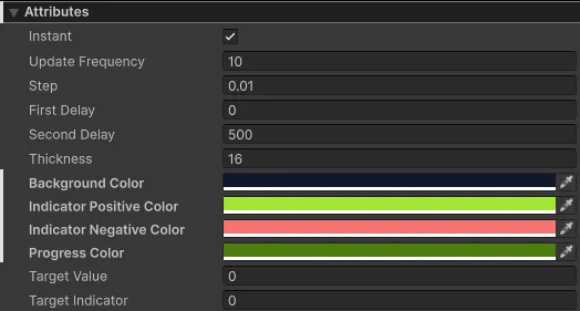
bar.PlayProgress();Attributes
| Attribute | Description |
|---|---|
| Animation Settings | |
| Instant Positive | If enabled, positive value changes are shown instantly without animation. |
| Instant Negative | If enabled, negative value changes are shown instantly without animation. |
| Update Frequency | Interval in milliseconds between animation updates. |
| Step | How much the progress bar moves per update (0-1 range). |
| First Delay | Delay before the first bar starts moving. Which bar moves first depends on whether the change is positive or negative. |
| Second Delay | Delay before the second bar starts moving. |
| Use Time Scale | When enabled (default: true), animations respect Time.timeScale. Set to false for UI that should animate independently of game time (e.g., loading screens). |
| Segment Settings | |
| Progress | Array of progress segments. Each has CurrentValue, TargetValue, and Color. Set via UXML to define segments with colors. |
| Indicator | Indicator segment shown behind progress segments. |
| SegmentCount | C# property only — not a UXML attribute. Number of segments (reads the live segment count). Setting it to a different value rebuilds the segments with empty values and colors, so prefer defining the progress array in UXML to preserve per-segment colors/values. |
| Arc Configuration | |
| Sweep Angle | Total arc span in degrees (0-360). Default is 360 (full circle). Use smaller values for partial arcs like speedometers. |
| Start Angle | Starting angle in degrees. Default is -90 (12 o'clock/top). 0 = right (3 o'clock), 90 = bottom, 180 = left. |
| Cell Settings (Optional) | |
| Cell Size | Value each cell represents. Set to 0 to disable cells. |
| Max Value | Maximum total value for cell calculation. |
| Cell Gap Degrees | Gap between cells in degrees. |
| Appearance | |
| Thickness | Width of the circular arc line. |
| Background Color | Background circle color. UXML: background-color. |
| Indicator Auto Color | When enabled, indicator color automatically switches between positive/negative colors. |
| Indicator Positive Color | Indicator color when showing a positive change. UXML: indicator-positive-color. |
| Indicator Negative Color | Indicator color when showing a negative change. UXML: indicator-negative-color. |
Progress Segment Attributes
Each element in the Progress array has:
| Attribute | Description |
|---|---|
| CurrentValue | Current fill value (0-1). Don't edit directly—use TargetValue instead. |
| TargetValue | Target fill value (0-1). Set this to change the fill level. |
| Color | Color of this progress segment. |
Custom USS Properties
Customize appearance by overriding these USS properties in your stylesheet.
For quick styling, add a palette color class like sky or red (the theme defines .radial-progress.red, .radial-progress.sky, etc.). See colors for options.
| Property | Description |
|---|---|
| --radial-progress-bg-color | Background circle color. |
| --radial-progress-progress-color | Color of the main progress arc. |
| --radial-progress-indicator-positive-color | Indicator color for positive changes. |
| --radial-progress-indicator-negative-color | Indicator color for negative changes. |
Public Methods
PlayProgress
Starts the animation to visually apply current Progress values.
public void PlayProgress()PlayIndicator
Starts the animation to visually apply the Indicator value.
public void PlayIndicator()RebuildSegments
Recreates the internal Progress array (with empty values) at the current segment count. Setting SegmentCount to a new value already triggers this automatically — call it manually only to force a reset.
public void RebuildSegments()GetTotalCurrentValue / GetTotalTargetValue
Helper methods for multi-segment bars. Returns the sum of all segment values.
public float GetTotalCurrentValue()
public float GetTotalTargetValue()
UXML Usage
Single Segment (Default)
<luna:RadialProgressBar
    name="health-radial"
    thickness="8"
    style="width: 100px; height: 100px;" />
Multi-Segment with Colors (UXML)
Set segments directly in UXML using the progress attribute. Format: CurrentValue|TargetValue|ColorHexRGBA| separated by commas.
<luna:RadialProgressBar
    name="health-radial"
    thickness="10"
    max-value="1000"
    cell-size="100"
    cell-gap-degrees="4"
    instant-positive="true"
    instant-negative="false"
    progress="1|1|53E653FF|,0|0|4CDCFFFF|,0|0|FFD933FF|"
    style="width: 120px; height: 120px;" />
This creates 3 segments:
- Segment 0: Green (#53E653) - Health
- Segment 1: Cyan (#4CDCFF) - Shield
- Segment 2: Gold (#FFD933) - Armor
instant-positive="true" instant-negative="false" is the Overwatch idiom: heals snap instantly, damage animates. Both flags default to true, so without instant-negative="false" damage would snap too.
Arc Configuration (Partial Arcs)
Create speedometer-style gauges or semi-circles using sweep-angle and start-angle:
<!-- 240° speedometer starting from bottom-left -->
<luna:RadialProgressBar
    name="speedometer"
    thickness="14"
    sweep-angle="240"
    start-angle="150"
    style="width: 180px; height: 180px;" />

<!-- 180° semi-circle from left to right -->
<luna:RadialProgressBar
    name="semicircle"
    thickness="14"
    sweep-angle="180"
    start-angle="180"
    style="width: 180px; height: 180px;" />

<!-- 270° arc starting from top -->
<luna:RadialProgressBar
    name="threequarter"
    thickness="14"
    sweep-angle="270"
    start-angle="-90"
    style="width: 180px; height: 180px;" />
Start Angle Reference:
-90(or270): Top (12 o'clock) - Default0: Right (3 o'clock)90: Bottom (6 o'clock)180: Left (9 o'clock)150: Bottom-left (classic speedometer position)
Animation Completion Events
RadialProgressBar provides events that fire when animations complete, enabling event-driven sequencing without polling.
Events
| Event | Type | Description |
|---|---|---|
| OnSegmentAnimationComplete | Action<int, bool> | Fires when a segment animation completes. Parameters: segment index, whether positive change. |
| OnIndicatorAnimationComplete | Action<bool> | Fires when indicator animation completes. Parameter: whether positive change. |
Usage
// Subscribe to segment completion
_radialBar.Data.OnSegmentAnimationComplete += (segmentIndex, isPositive) =>
{
    Debug.Log($"Segment {segmentIndex} animation complete");
};

// Subscribe to indicator completion
_radialBar.Data.OnIndicatorAnimationComplete += (isPositive) =>
{
    Debug.Log($"Indicator animation complete");
};
Multi-Pass Animation
The PlayMultiPass() extension method animates through multiple full 0→100% cycles. This is useful for XP bars when gaining enough experience to level up multiple times.
// Player gains enough XP for 3 level-ups
_radialXpBar.PlayMultiPass(
    oldNormalized: 0.5f,    // Starting at 50%
    passes: 3,              // 3 full rotations
    newNormalized: 0.25f,   // Ending at 25%
    onComplete: () => Debug.Log("XP animation done"),
    onPassComplete: (pass) => Debug.Log($"Level up #{pass + 1}!")
);
Multi-Pass Methods
// Cancel an active multi-pass sequence
_radialBar.CancelMultiPass();

// Check if multi-pass is currently running
bool isActive = _radialBar.IsMultiPassActive();
C# Examples
Basic Single Segment
using UnityEngine;
using UnityEngine.UIElements;
using CupkekGames.Luna;

public class RadialProgressDemo : MonoBehaviour
{
    private PanelRenderer _panelRenderer;
    private RadialProgressBar _healthBar;

    private void Awake()
    {
        // PanelRenderer delivers the visual tree asynchronously —
        // register a reload callback and query elements when it fires.
        _panelRenderer = GetComponent<PanelRenderer>();
        if (_panelRenderer != null)
        {
            _panelRenderer.RegisterUIReloadCallback(OnUIReload);
        }
    }

    private void OnUIReload(PanelRenderer renderer, VisualElement root, int version)
    {
        if (_healthBar != null) return; // sentinel: only init once

        _healthBar = root.Q<RadialProgressBar>("health-radial");

        // Initialize without animation
        _healthBar.InstantPositive = true;
        _healthBar.InstantNegative = true;

        _healthBar.Progress[0].TargetValue = 1f;
        _healthBar.Indicator.TargetValue = 1f;
        _healthBar.PlayProgress();
        _healthBar.PlayIndicator();

        // Enable animation for future changes
        _healthBar.InstantPositive = false;
        _healthBar.InstantNegative = false;
    }

    private void OnDestroy()
    {
        if (_panelRenderer != null)
        {
            _panelRenderer.UnregisterUIReloadCallback(OnUIReload);
        }
    }

    public void TakeDamage(float amount)
    {
        _healthBar.Progress[0].TargetValue -= amount;
        _healthBar.Indicator.TargetValue = _healthBar.Progress[0].TargetValue;
        _healthBar.PlayProgress();
        _healthBar.PlayIndicator();
    }
}
Multi-Segment (Overwatch Style)
When using UXML to define segments with colors, the code becomes simpler:
using UnityEngine;
using UnityEngine.UIElements;
using CupkekGames.Luna;

public class OverwatchHealthBar : MonoBehaviour
{
    private PanelRenderer _panelRenderer;
    private RadialProgressBar _healthBar;

    private int _health = 1000;
    private int _shield = 0;
    private int _armor = 0;
    private const int BaseMaxHealth = 1000;

    private void Awake()
    {
        _panelRenderer = GetComponent<PanelRenderer>();
        if (_panelRenderer != null)
        {
            _panelRenderer.RegisterUIReloadCallback(OnUIReload);
        }
    }

    private void OnUIReload(PanelRenderer renderer, VisualElement root, int version)
    {
        if (_healthBar != null) return; // sentinel: only init once

        _healthBar = root.Q<RadialProgressBar>("health-radial");

        // Segments and colors are already set via UXML progress attribute
        UpdateHealthBar();
    }

    private void OnDestroy()
    {
        if (_panelRenderer != null)
        {
            _panelRenderer.UnregisterUIReloadCallback(OnUIReload);
        }
    }

    public void TakeDamage(int damage)
    {
        // Damage order: Armor → Shield → Health
        if (_armor > 0)
        {
            int armorDamage = Mathf.Min(_armor, damage);
            _armor -= armorDamage;
            damage -= armorDamage;
        }
        if (damage > 0 && _shield > 0)
        {
            int shieldDamage = Mathf.Min(_shield, damage);
            _shield -= shieldDamage;
            damage -= shieldDamage;
        }
        if (damage > 0)
        {
            _health = Mathf.Max(0, _health - damage);
        }

        UpdateHealthBar();
    }

    private void UpdateHealthBar()
    {
        float total = BaseMaxHealth + _shield + _armor;
        _healthBar.MaxValue = total;

        // Calculate normalized values
        float healthNorm = _health / total;
        float shieldNorm = _shield / total;
        float armorNorm = _armor / total;

        // Update segments (colors already set from UXML)
        var segments = _healthBar.Progress;
        segments[0].TargetValue = healthNorm;
        segments[1].TargetValue = shieldNorm;
        segments[2].TargetValue = armorNorm;

        _healthBar.Data.Indicator.TargetValue = healthNorm + shieldNorm + armorNorm;

        _healthBar.PlayProgress();
        _healthBar.PlayIndicator();
    }
}
How Multi-Segment Rendering Works
When SegmentCount > 1, the RadialProgressBar draws consecutive arcs in a single element:
- Segment 0 starts at the
StartAngleposition (default: top/12 o'clock) - Segment 1 starts where Segment 0 ends
- Segment 2 starts where Segment 1 ends
- And so on...
Each segment's TargetValue represents its portion of the SweepAngle. The total of all segments should typically equal 1.0 (full arc), but can be less for partial fills.
Single RadialProgressBar with SegmentCount = 3

        ┌──────────────┐
       /   Segment 2    \     ← Blue (shields)
      /  ┌──────────┐    \
     │  /  Segment 1 \    │   ← Yellow (armor)
     │ │  ┌────────┐  │   │
     │ │  │Segment0│  │   │   ← Green (health)
     │ │  └────────┘  │   │
     │  \            /    │
      \  └──────────┘    /
       \                /
        └──────────────┘

All segments are drawn as consecutive arcs
in the SAME circle, not stacked rings.
Note: This is different from stacking multiple RadialProgressBar elements with different sizes (concentric rings). The multi-segment feature draws all segments in a single arc on the same circle.
See also
- Progress Bar overview — component family hub
- Linear Progress Bar — full attribute / API reference for the rectangular bar
- RPG Demo — shader-driven custom visuals via
SetNodeUpdater - Architecture — data/controller internals, building custom bars
- Radial Loading — indeterminate spinner variant
- CooldownWipe — pie-slice mask for skill cooldowns
Settings
Theme
Light
Contrast
Material
Dark
Dim
Material Dark
System
Sidebar(Light & Contrast only)
Font Family
DM Sans
Wix
Inclusive Sans
AR One Sans
Direction