
GridView
GridViewBase<TItem> is the abstract base for paginated, filterable grid views. It owns the grid layout, slot lifecycle, filter application, and selection state. Subclass it to bind your item data to slot UXML; or pick one of the two ready-made subclasses below: GridViewPagination<TItem> for paginated grids with a button strip, GridViewList<TItem> for virtualized scrolling backed by a Unity ListView.
Examples
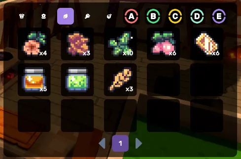
Heroes
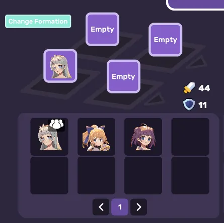
GridView is a large class with lots of properties so it can be complex, but each property is simple on its own.
API
Constructor
public GridViewBase(
    List<TItem> itemList,
    VisualTreeAsset itemSlotTemplate,
    GameObject parent,
    VisualElement parentElement,
    VisualElement slotContainer,
    TooltipController tooltipController = null,
    bool startVisible = true,
    VisualElement focusElement = null,
    float fadeDuration = 0.5f,
    EasingMode easingMode = EasingMode.EaseOutCirc,
    bool disableOtherViewsOnFadeIn = false,
    bool debug = false
)| Parameter | Type | Default | Description |
|---|---|---|---|
| itemList | List<TItem> | — | Data source, list of items to display |
| itemSlotTemplate | VisualTreeAsset | — | Template for each grid item slot |
| parent | GameObject | — | Host GameObject — the view registers itself on its UIViewReference |
| parentElement | VisualElement | — | Root VisualElement the view shows/fades |
| slotContainer | VisualElement | — | Container the grid lines/slots are built into |
| tooltipController | TooltipController | null | Optional tooltip controller, closed on page/filter changes |
| startVisible | bool | true | Initial visibility applied in the constructor |
| focusElement | VisualElement | null | Element given keyboard/gamepad focus on fade-in |
| fadeDuration | float | 0.5f | Fade in/out duration in seconds |
| easingMode | EasingMode | EaseOutCirc | Easing applied to the fade |
| disableOtherViewsOnFadeIn | bool | false | Blocks input on all other registered pages while this view is visible |
| debug | bool | false | Verbose lifecycle logging |
The last seven parameters are shared verbatim by GridViewPagination and GridViewList (see below), so one mental model covers all three. The final five (focusElement through debug) are the standard UIView constructor tail; tooltipController and startVisible are grid-level extras (startVisible is applied via ApplyStartVisibility — UIView's constructor no longer takes it).
Properties
| Property | Type | Description |
|---|---|---|
| SlotContainer | VisualElement | The container holding item slots |
| SlotPerLine | int | Current number of slots per grid line |
| ItemSlots | List<VisualElement> | List of all created item slot elements |
| SelectedItems | HashSet<TItem> | Currently selected items |
Events
| Event | Description |
|---|---|
OnSlotCreated (Action<VisualElement>) | Fires per slot as it is created. Slots materialize lazily — GridViewList's lines are built by the list view's layout pass, not by CreateSlots() itself — so an external pass over ItemSlots right after CreateSlots() misses the initial fill. Subscribe here (or do per-item work in BindItem, which also covers virtualization rebinds) instead. |
Methods
CreateSlots
Creates the grid slot elements. Must be implemented by derived classes.
public abstract void CreateSlots();Refresh
Refilters and refreshes all items in the grid.
public void Refresh()SetItemList
Updates the data source and refreshes the grid. Grids that read a live source instead (the inventory package's InventoryViewPagination built over an InventoryBase) reject it loudly; call Refresh() there, or AttachToView so the grid re-reads its source on every show.
public void SetItemList(List<TItem> itemList)Selection Methods
public abstract void Select(int slotIndex);
public abstract void Deselect(int slotIndex);
public void DeselectAll();
Filter Methods
SetFilters
Sets the filter functions for the grid.
public void SetFilters(List<Func<List<TItem>, int, List<TItem>>> filters)SetFilter
Applies a filter value at the specified filter index.
public void SetFilter(int filterIndex, int filter)ClearFilter
Clears the filter at the specified index.
public void ClearFilter(int filterIndex)GetFilter
Gets the current filter value at the specified index.
public int GetFilter(int index)GetFilteredList
Returns the filtered list based on current filters.
public virtual List<TItem> GetFilteredList(List<int> filters)Filter Button Methods
SetFilterButtons
Sets up filter toggle buttons.
public void SetFilterButtons(List<List<Button>> filterButtons)SetFilterClearButtons
Sets up filter clear buttons.
public void SetFilterClearButtons(List<List<Button>> filterClearButtons)SetEnabledFilterButtons
Enables or disables filter buttons at an index.
public void SetEnabledFilterButtons(int filterIndex, bool enabled)UpdateFilterButtons
Updates filter button visual states.
public void UpdateFilterButtons(int filterIndex)Configuration Methods
SetHideEmpty
When true, empty slots are hidden (visibility: hidden) instead of shown. Hidden slots keep their layout footprint, so rows stay stable across pages.
public void SetHideEmpty(bool hideEmpty)SetCollapseEmpty
When true, empty slots collapse (display: none) instead of keeping their width. Use it for lists that should read as a centered cluster when a row is only partly filled (a bench of three heroes in a five-wide grid). Takes precedence over SetHideEmpty for empty slots; filled slots are always restored.
public void SetCollapseEmpty(bool collapseEmpty)SetSelectedFilterColor
Sets the color class applied to selected filter buttons (a Luna color-class name like "sky"). Pass null or an empty string when your filter buttons already carry their own palette word (a kit-styled chip, say): the view then toggles only the selected-state class and never overrides the button's color.
public void SetSelectedFilterColor(string color)SetSelectedFilterClass
Sets the USS class applied to selected filter buttons.
public void SetSelectedFilterClass(string selectedFilterClass)SetFilterClass
Sets the USS class applied to all filter buttons.
public void SetFilterClass(string filterClass)Input Methods
SetInputPrompt
Sets up input prompts for tab navigation (prev/next filters).
public void SetInputPrompt(InputPrompt filterItemPrevious, InputPrompt filterItemNext)PreviousTab / NextTab
Navigate between filter tabs.
public void PreviousTab()
public void PreviousTab(int filterIndex)
public void NextTab()
public void NextTab(int filterIndex)
RegisterInput / UnregisterInput
Manually register or unregister input handlers.
public void RegisterInput()
public void UnregisterInput()
Dynamic Layout
RegisterDynamicItemPerLineUpdate
Registers a callback to update items per line when container size changes.
public void RegisterDynamicItemPerLineUpdate()
public void UnregisterDynamicItemPerLineUpdate()
Abstract Methods to Implement
When extending GridViewBase, implement these methods:
// Create slot visual elements
public abstract void CreateSlots();

// Refresh items in slots
protected abstract void RefreshItems();

// Filter list based on current filters
protected abstract void FilterList();

// Handle filter changes
protected abstract void OnFilterChange(int filterIndex);

// Handle dynamic layout changes
protected abstract void DynamicItemPerLineUpdate(GeometryChangedEvent evt);

// Called when creating each slot
protected abstract void OnItemCreate(VisualElement slot);

// Unbind item from slot
protected abstract void UnbindItem(VisualElement slot);

// Bind item to slot
protected abstract void BindItem(VisualElement slot, TItem item, int slotIndex, bool selected);

// Selection handling
public abstract void Select(int slotIndex);
public abstract void Deselect(int slotIndex);
Example Implementation
using System.Collections.Generic;
using UnityEngine;
using UnityEngine.UIElements;
using CupkekGames.Luna;

public class InventoryGridView : GridViewBase<InventoryItem>
{
    private List<InventoryItem> _filteredList;

    public InventoryGridView(
        List<InventoryItem> items,
        VisualTreeAsset template,
        GameObject parent,
        VisualElement parentElement,
        VisualElement container
    ) : base(items, template, parent, parentElement, container)
    {
        _slotPerLine = 4;
        _itemWidth = 80;
    }

    public override void CreateSlots()
    {
        _slotContainer.Clear();
        ItemSlots.Clear();

        int lineCount = Mathf.CeilToInt((float)_itemList.Count / _slotPerLine);
        for (int i = 0; i < lineCount; i++)
        {
            VisualElement line = MakeLine();
            _slotContainer.Add(line);
        }

        RefreshItems();
    }

    protected override void FilterList()
    {
        _filteredList = GetFilteredList(_currentFilters);
    }

    protected override void RefreshItems()
    {
        for (int i = 0; i < ItemSlots.Count; i++)
        {
            VisualElement slot = ItemSlots[i];

            if (i < _filteredList.Count)
            {
                InventoryItem item = _filteredList[i];
                bool selected = _selectedItems.Contains(item);
                BindItem(slot, item, i, selected);
                slot.style.visibility = Visibility.Visible;
            }
            else
            {
                UnbindItem(slot);
                slot.style.visibility = _hideEmpty ? Visibility.Hidden : Visibility.Visible;
            }
        }
    }

    protected override void OnItemCreate(VisualElement slot)
    {
        // Initial slot setup
        slot.AddToClassList("inventory-slot");
    }

    protected override void BindItem(VisualElement slot, InventoryItem item, int index, bool selected)
    {
        var icon = slot.Q<VisualElement>("Icon");
        icon.style.backgroundImage = new StyleBackground(item.Icon);

        var label = slot.Q<Label>("Name");
        label.text = item.Name;

        if (selected)
        {
            slot.AddToClassList("selected");
        }
        else
        {
            slot.RemoveFromClassList("selected");
        }
    }

    protected override void UnbindItem(VisualElement slot)
    {
        var icon = slot.Q<VisualElement>("Icon");
        icon.style.backgroundImage = null;

        var label = slot.Q<Label>("Name");
        label.text = "";

        slot.RemoveFromClassList("selected");
    }

    protected override void OnFilterChange(int filterIndex)
    {
        // Handle filter change - e.g., update category header
    }

    protected override void DynamicItemPerLineUpdate(GeometryChangedEvent evt)
    {
        float width = _slotContainer.resolvedStyle.width;
        int newSlotPerLine = Mathf.Max(1, Mathf.FloorToInt(width / _itemWidth));

        if (newSlotPerLine != _slotPerLine)
        {
            _slotPerLine = newSlotPerLine;
            CreateSlots();
        }
    }

    public override void Select(int slotIndex)
    {
        if (slotIndex < _filteredList.Count)
        {
            _selectedItems.Add(_filteredList[slotIndex]);
            RefreshItems();
        }
    }

    public override void Deselect(int slotIndex)
    {
        if (slotIndex < _filteredList.Count)
        {
            _selectedItems.Remove(_filteredList[slotIndex]);
            RefreshItems();
        }
    }
}
GridViewPagination
GridViewPagination<TItem> extends GridViewBase<TItem> and adds pagination support. Items are split across pages and rendered into a fixed number of grid lines.
Constructor
public GridViewPagination(
    List<TItem> itemList,
    VisualTreeAsset itemSlotTemplate,
    GameObject parent,
    VisualElement parentElement,
    VisualElement slotContainer,
    TooltipController tooltipController = null,
    bool startVisible = true,
    VisualElement focusElement = null,
    float fadeDuration = 0.5f,
    EasingMode easingMode = EasingMode.EaseOutCirc,
    bool disableOtherViewsOnFadeIn = false,
    bool debug = false
)
Properties
| Property | Type | Description |
|---|---|---|
| Pagination | PaginationController<TItem> | The pagination controller managing page state and UI |
Public Methods
SetPagination
Sets the number of lines and items per line, updating items per page.
public void SetPagination(int lineCount, int perLine)| Parameter | Type | Description |
|---|---|---|
| lineCount | int | Number of grid lines (rows) to display |
| perLine | int | Number of items per line |
SetDynamicItemPerLine (GridViewPagination)
Calculates items per line based on container width and item width.
public void SetDynamicItemPerLine(int lineCount, int itemWidth)| Parameter | Type | Description |
|---|---|---|
| lineCount | int | Number of grid lines (rows) to display |
| itemWidth | int | Width of each item in pixels |
SetPaginationUI
Configures the pagination button UI.
public void SetPaginationUI(VisualElement parent, string normal, string active, int maxButtonAmount)| Parameter | Type | Description |
|---|---|---|
| parent | VisualElement | Container element for pagination buttons |
| normal | string | Color-class name for non-active page buttons |
| active | string | Color-class name for the active page button |
| maxButtonAmount | int | Maximum number of page buttons to display |
GridViewList
GridViewList<TItem> extends GridViewBase<TItem> and renders through LunaListView — Luna's fixed-height virtualizer on LunaScroller. Only visible line rows are realized (recycled through a pool), making it efficient for large data sets, and the gesture is Luna-owned: momentum, rubber-band ends, wheel, styled scrollbar, and no ScrollView elastic-clamp tail jump, structurally. Columns are dynamic-only (width-driven), and it can swap row height and scrollbar visibility per breakpoint.
Your UXML keeps declaring <ui:ListView> — construction replaces it in-place with a LunaListView, carrying over the name, classes, inline sizing, fixed-item-height, and vertical-scrollbar visibility. Style the element via classes; USS that targeted the ListView type selector or unity-list-view class names no longer matches.
Constructor
public GridViewList(
    List<TItem> itemList,
    VisualTreeAsset itemSlotTemplate,
    GameObject parent,
    VisualElement parentElement,
    ListView slotContainer,
    TooltipController tooltipController = null,
    bool startVisible = true,
    VisualElement focusElement = null,
    float fadeDuration = 0.5f,
    EasingMode easingMode = EasingMode.EaseOutCirc,
    bool disableOtherViewsOnFadeIn = false,
    bool debug = false
)
Note:
slotContaineris aListViewinstead of a plainVisualElement.
Delegate binders — skip the subclass
For trivial bind logic you don't need a GridViewList/GridViewPagination subclass at all. DelegateGridViewList<TItem> and DelegateGridViewPagination<TItem> take the three binder hooks as delegates — the same idiom as Unity's own ListView.makeItem/bindItem:
_grid = new DelegateGridViewList<int>(
    items, slotTemplate, gameObject, gridParent, listView,
    makeItem:   slot => slot.userData = new MySlotController(slot),
    bindItem:   (slot, item, index, selected) => ((MySlotController)slot.userData).Bind(item, index),
    unbindItem: slot => ((MySlotController)slot.userData).Unbind()
);
The delegates slot in right after slotContainer; the optional tail (tooltipController…debug) is unchanged. Subclass only when you need to override more than the three binder hooks.
Properties
| Property | Type | Description |
|---|---|---|
| List | LunaListView | The live list element (scroll via List.ScrollOffset) |
| ListView | — | Removed — referencing it is a compile error pointing at List |
Columns
GridViewList columns are width-driven by default: the count is floor(containerWidth / unit), clamped to at least 1, where the unit is max(minItemWidth, measured item footprint). The grid measures the slot template's natural width (plus margins) once with a hidden probe instance — so a template wider than the configured minimum wraps items down a line instead of overflowing the row, and minItemWidth keeps its meaning as the floor for narrower or flexible templates. For a pinned count (a single-column list, a fixed 3-up grid), use SetFixedItemPerLine — fixed mode ignores measurement.
SetDynamicItemPerLine (GridViewList)
Sets the minimum slot width and recomputes the column count from the container's current width — CSS repeat(auto-fit, minmax(minItemWidth, 1fr)). Give the slot template flex-grow: 1 so cards fill the row (the 1fr).
public void SetDynamicItemPerLine(int minItemWidth)| Parameter | Type | Description |
|---|---|---|
| minItemWidth | int | Minimum slot width in px (the minmax floor) |
Pair with RegisterDynamicItemPerLineUpdate so the count recomputes as the container resizes.
This is a grid-specific container query. To restyle any element by its own width (not just a grid's column count), use
LunaContainerQuery— the general per-element version.
SetFixedItemPerLine (GridViewList)
Pins the column count regardless of container width — the honest way to make a plain list (one column) or any fixed grid out of a GridViewList. Clears the width-derived baseline so responsive configs don't inherit a bogus MinItemWidth.
public void SetFixedItemPerLine(int itemsPerLine)| Parameter | Type | Description |
|---|---|---|
| itemsPerLine | int | Columns to always use (clamped to ≥ 1) |
_list.SetFixedItemPerLine(1); // single-column leaderboard-style listRemoved:
SetSlotPerLine(int)and the oldmaxColumnsparameter onSetDynamicItemPerLine. For a pinned column count useSetFixedItemPerLine— don't pass an oversizedminItemWidthto the dynamic overload; it poisons the responsive baseline.
Responsive configuration (per breakpoint)
GridViewList can swap the C#-only settings that USS can't reach — scrollbar visibility, row height, wheel speed, and the column floor — when the active breakpoint changes. It listens to LunaResponsiveSettingsSO.BreakpointChanged (see Responsive) and applies the matching config. Exactly one breakpoint is active at a time — resolved from the viewport's logical width against the ladder (default "sm" / "md" / "lg"), so name your configs to match the tiers you author.
Since the
LunaListViewflip, theScrollView-only fields (ScrollMode,HorizontalScroller,TouchScroll,ScrollDecelerationRate,Elasticity) have no live counterpart and are ignored (a debug note logs when a config sets them).VerticalScrollermaps to the scrollbar (Hiddenhides it),MouseWheelScrollSizemaps to wheel speed, andFixedItemHeight/MinItemWidthwork as before — the elastic path those knobs tuned no longer exists.
GridViewResponsiveConfig
The runtime config. Every field is nullable — null means inherit: fall through to the default config, then to the element's captured baseline (its authored value, snapshotted before any config is applied). Because of that baseline fallback, leaving a breakpoint that set a field reverts it automatically.
public struct GridViewResponsiveConfig
{
    public ScrollerVisibility?             VerticalScroller;
    public ScrollerVisibility?             HorizontalScroller;
    public float?                          FixedItemHeight;   // ListView row height
    public int?                            MinItemWidth;      // dynamic column floor
    public ScrollViewMode?                 ScrollMode;        // see orientation note
    public ScrollView.TouchScrollBehavior? TouchScroll;
    public float?                          ScrollDecelerationRate;
    public float?                          Elasticity;
    public float?                          MouseWheelScrollSize;
}
SetResponsiveConfig / SetResponsiveConfigs
Register a config per breakpoint. Use "" (or null) for the default baseline merged under every breakpoint; a named breakpoint (e.g. "sm") overrides only the fields it sets.
public void SetResponsiveConfig(string breakpoint, GridViewResponsiveConfig config);
public void SetResponsiveConfigs(IEnumerable<GridViewBreakpointSettings> settings);
SetResponsiveConfigs takes the inspector-authorable GridViewBreakpointSettings (below) and converts each entry.
RegisterResponsive / UnregisterResponsive
Subscribe / unsubscribe to BreakpointChanged and apply the current breakpoint immediately. Always pair them — the settings asset is long-lived, so an unregistered view would leak a dead subscriber. Dispose also calls UnregisterResponsive.
public void RegisterResponsive();
public void UnregisterResponsive();
This complements RegisterDynamicItemPerLineUpdate, it doesn't replace it: geometry handles continuous resize within a breakpoint; BreakpointChanged handles the discrete config swap across breakpoints.
GridViewBreakpointSettings (inspector)
GridViewResponsiveConfig's nullable fields can't be serialized by Unity, so author per-breakpoint configs in the inspector with GridViewBreakpointSettings — a [Serializable] mirror using Inherit-first enum dropdowns and non-positive sentinels (<= 0 = inherit). Expose a List<GridViewBreakpointSettings> and feed it to SetResponsiveConfigs.
[SerializeField]
private List<GridViewBreakpointSettings> _responsiveConfigs = new()
{
    // "" = the default baseline, reverted to on desktop
    new GridViewBreakpointSettings { Breakpoint = "", MinItemWidth = 150, FixedItemHeight = 260 },

    // "sm" = mobile override: tighter columns, shorter rows, no scrollbar, elastic touch
    new GridViewBreakpointSettings
    {
        Breakpoint       = "sm",
        MinItemWidth     = 120,
        FixedItemHeight  = 200,
        VerticalScroller = GridViewBreakpointSettings.ScrollerVisibilityOption.Hidden,
        TouchScroll      = GridViewBreakpointSettings.TouchScrollOption.Elastic,
    },
};

// in your view setup:
_grid.SetResponsiveConfigs(_responsiveConfigs);
_grid.RegisterDynamicItemPerLineUpdate();
_grid.RegisterResponsive();
Reverting is automatic. An
Inheritfield falls back to the element's authored baseline (snapshotted on the first apply), so leaving a breakpoint that set a field restores the original — e.g.smhides the scroller, and moving to a wider tier (md/lg) shows it again. You only need a""default entry when you want a baseline that differs from the element's authored UXML/USS value.
Debugging. Call
SetResponsiveDebug(true)on the grid to log the resolved config on every breakpoint apply —[GridViewList] breakpoint 'sm' applied — vScroller=Hidden, ….
Orientation caveat. A
ListViewvirtualizes vertically.ScrollMode = Horizontalenables horizontal overflow scrolling but does not reflow rows into a horizontal carousel — that needs a non-ListView grid. The reliable responsive knobs are scroller visibility, row height, column floor, and scroll physics.
Unity elastic-scroll bug on very tall content. Unity's
ScrollViewclamps the drag baseline inComputeElasticOffsetto 95% of an absolute offset, so withTouchScroll = Elasticand content taller than about 20 viewport heights, a drag that starts inside the last ~5% of the list stops tracking the finger: the list jumps dozens of rows on a small swipe. This is aUnityEngine.UIElements.ScrollViewdefect, not a Luna one, but it surfaces through this config on long lists (verified on 6000.5). Short lists never see it. Workarounds: useClampedfor very long lists, or swapElastictoClampedonly for the duration of a drag that starts near the very bottom (decide atPointerDownEvent; the cost is no rubber-band on the final rows).
Related
- Pagination - For paginated grids
- Tooltip - Item tooltips
Settings
Theme
Light
Contrast
Material
Dark
Dim
Material Dark
System
Sidebar(Light & Contrast only)
Font Family
DM Sans
Wix
Inclusive Sans
AR One Sans
Direction